Laguna Matchmaking - Innovative AI-based Online Dating App
Want to win a job like this?
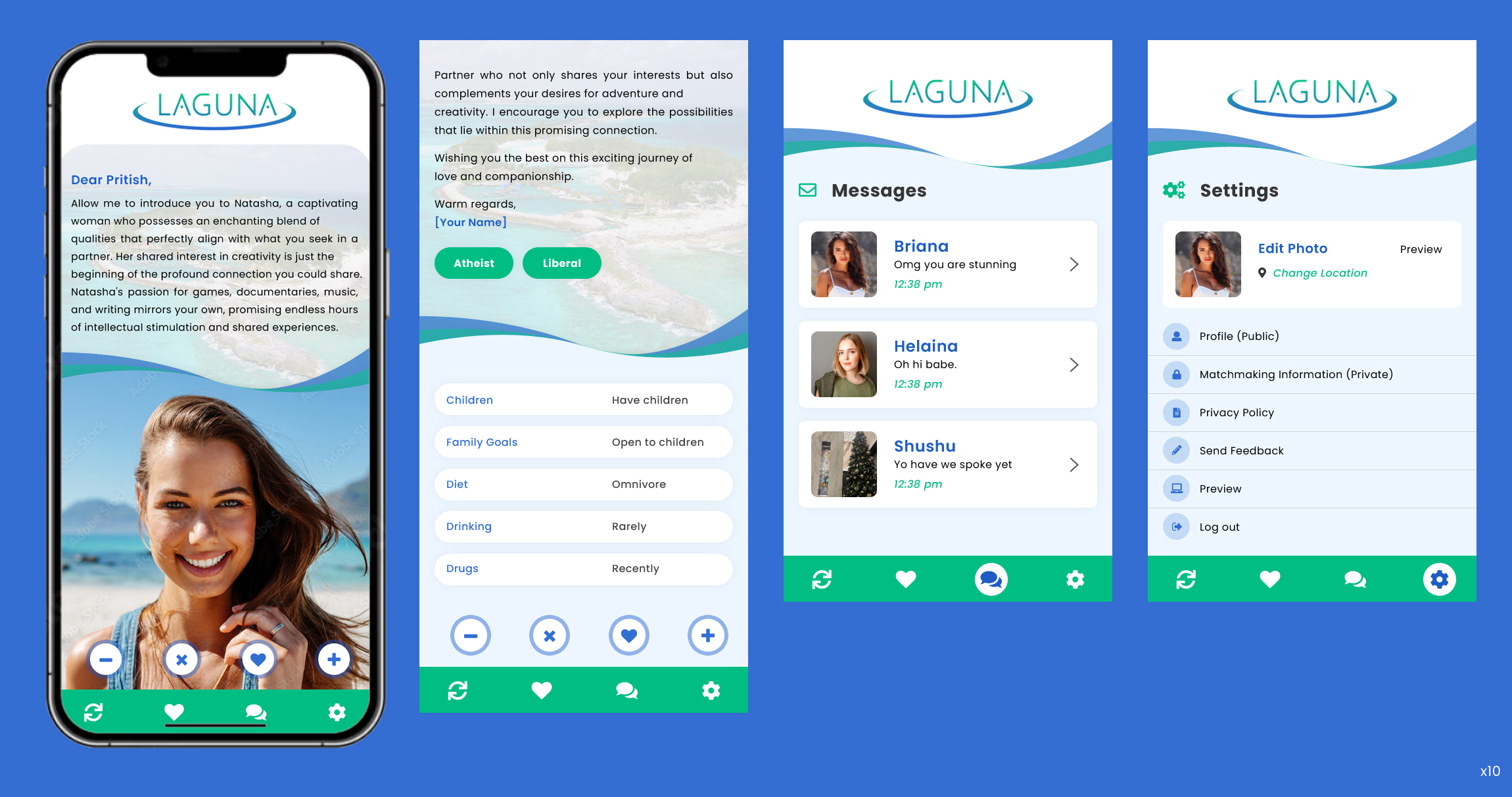
This customer received 89 app designs from 17 designers. They chose this app design from pb as the winning design.
Join for free Find Design Jobs- Guaranteed
-
 US$390
-
 89 designs
-
 17 designers
App Design Brief
Hello, I am creating a new online dating app that subsumes the personalization and compatibility analysis of human matchmaking, but is combined with the convenience of modern dating apps such as hinge. The app is called Laguna.
There is a lot of pain and fatigue in modern online dating. Laguna uses a concise but effective questionnaire that is combined with cutting-edge AI, social psychology research, and psycholinguistic modelling to effectively and conveniently find dating matches with real compatibility - as opposed to any major app on the market. A personalized introduction for every user is generated everyday to introduce you to a new potential match - this introduction is totally unique and will never be seen before or again. The introduction is intertwined with the user’s images to create an attractive “newsletter” feel.
"Laguna" is Italian for lagoon, which is "a shallow body of water protected from a larger body of water (usually the ocean) by sandbars, barrier islands, or coral reefs." Lagoons are beautiful, tropical, lush watery paradises - as I see it. This is meant to be the inspiration for the feel, color scheme and design of the app.
To that end, I have included concept images of lagoons to evoke the feeling of a paradise getaway where one may meet their soulmate. This is the feeling I would like to convey with the minimalist app design this product needs to compete.
I have included screenshots of the current app UI. There is a screen for
1) potential matches and incoming likes (just like Hinge) with a logo at the top. There are “Like”, “Dislike”, “Super Like”, and “Super Dislike” buttons that float over the screen as it scrolls. These button shape/colors likely need to change to match the rest of the design
2) Overview of message threads with each match
3) View of message threads
4) Settings page
I would like
1) the logo/header image to be redone (as well as the like/dislike/super like/super dislike buttons to be redone to match the new design)
2) icons for the 4 pages in the bottom navigation bar to be redone
3) color scheme to be optimized and evoking of the desired paradise but professional feeling of a hyper-intelligent (but also empathetic) matchmaker
4) design for the settings screen (to look professional and competitive with other dating apps)
The color scheme /layout/spacing/font(s) for the bubbles on the screen where new potential matches are introduced is the most important part of the design I’m looking for. It’s currently a stack of rounded rectangles basically, but I’m open to all ideas to make this app look as professional as possible while conveying the desired elegance, empathy, and uniqueness of the brand.
Thank you!
Updates
Designs look the same
Target Market(s)
Single men and women ages 20 - 45
Industry/Entity Type
Online dating / Matchmaking
Look and feel
Each slider illustrates characteristics of the customer's brand and the style your logo design should communicate.
Elegant
Bold
Playful
Serious
Traditional
Modern
Personable
Professional
Feminine
Masculine
Colorful
Conservative
Economical
Upmarket
Requirements
Must have
- For the main screen where new users are being introduced (i.e. the "swipe" page on most dating apps) - some amount of matchmaking introductory text MUST be shown above the user's first profile picture, as indicated in the current screenshots.
Nice to have
- Re-designs of the top "Laguna" logo/emblem would be nice. If changing the logo, some emblem or graphic in addition to just the text of "Laguna" would be nice. (Like the way "tinder" has its red flame emblem)
Should not have
- The main "swipe" page should not look identical to other dating apps in the sense of being >90% just a user's first dating profile image. The competitive edge to this app is the user-to-user specific matchmaking introductory text, so some of that must be visible before a user scrolls down for further profile information.