LOGO DESIGN: Knot Me (adult novelty branding)
Want to win a job like this?
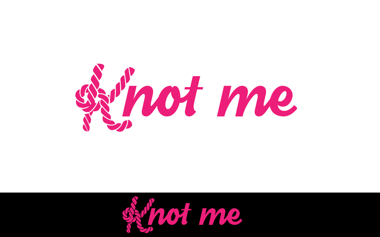
This customer received 173 logo designs from 94 designers. They chose this logo design from Justin E as the winning design.
Join for free Find Design Jobs- Guaranteed
-
 US$150
-
 173 designs
-
 94 designers
Logo Design Brief
Knot Me is a new, rebranding adult novelty company.
Pink
Text Only
The idea behind it is to be a higher end adult store that is enticing to women. We want to get away from the stigma of these stores being a creepy vibe.
One of the partners ideas: " Just the letter K made with a knot and all the letters be in medium thickness script. Pink letters with black outline I would like the only letter capitalized would be the “K”. The K made out of rope/looks like rope.
Target Market(s)
women
Industry/Entity Type
Adult Stores
Logo Text
KNOT ME
Logo styles of interest
Emblem Logo
Logo enclosed in a shape
Pictorial/Combination Logo
A real-world object (optional text)
Abstract Logo
Conceptual / symbolic (optional text)
Colors
Designer to choose colors to be used in the design.
Look and feel
Each slider illustrates characteristics of the customer's brand and the style your logo design should communicate.