Modern Contemporary Law Firm Logo
Want to win a job like this?
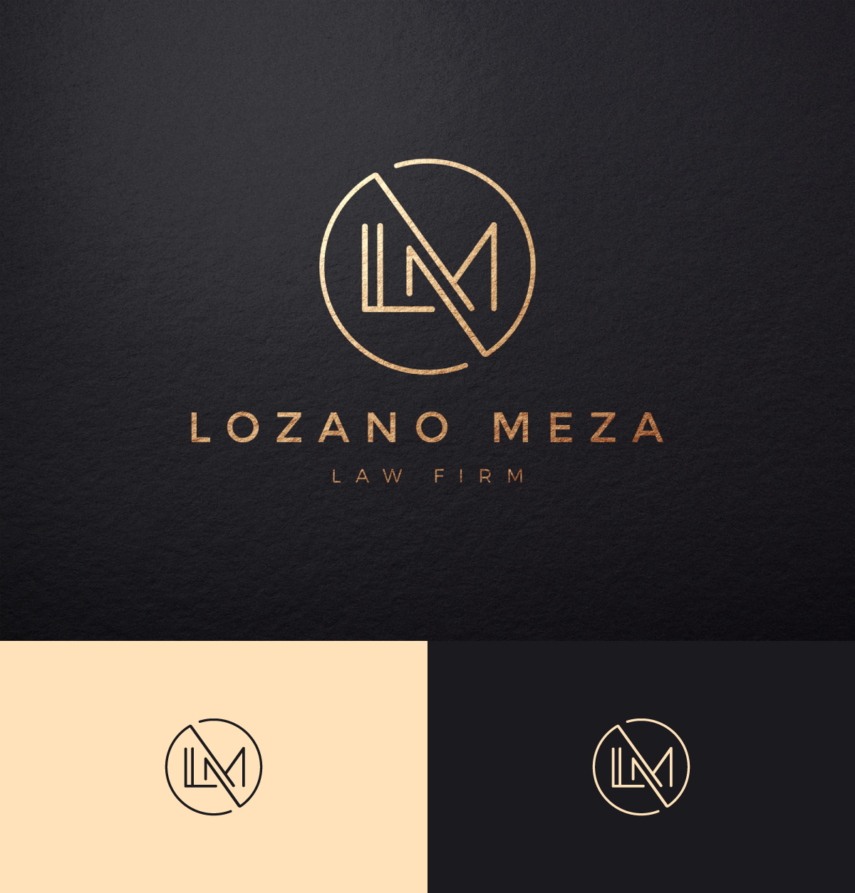
This customer received 401 logo designs from 187 designers. They chose this logo design from apik. as the winning design.
Join for free Find Design Jobs-
 US$150
-
 401 designs
-
 187 designers
Logo Design Brief
New logo for the new law firm name. We are currently the Carmona Lozano Meza Law Firm ("CLM"), and had success and positive feedback with the current logo (which was designed through this site as well); however, Partner Omar Carmona is leaving the firm and the firm will be changing to Lozano Meza Law Firm.
Partner Cesar Lozano and myself (Eric Meza), initially wanted to keep the bones of the current logo, but remove the "C", slide the "L" to the left a little bit and spread the "L" and "M" out a little bit—minimal changes.
However, we're open to creativity and ideas of the current version OR of the designers own ideas. I've attached numerous images found on google to further illustrate the ideas below.
Overall, we're going for:
- modern
- clean/polished
- thin letters for the "L M" but then thicker font (similar to if you "bolded" a font on microsoft word) for "Lozano Meza Law Firm" spelled out underneath the logo.
The elements of the current logo we like are:
- the circle around the letters to signify unity and cohesiveness;
- the font (we like thin and modern font); and
- the blue that was used.
We also like the logo in the "Naked Space Photo." Maybe a more modern and contemporary font with that the coloring and play within this logo.
Logo Text
"Lozano Meza Law Firm" or "LM Law Firm"
Look and feel
Each slider illustrates characteristics of the customer's brand and the style your logo design should communicate.