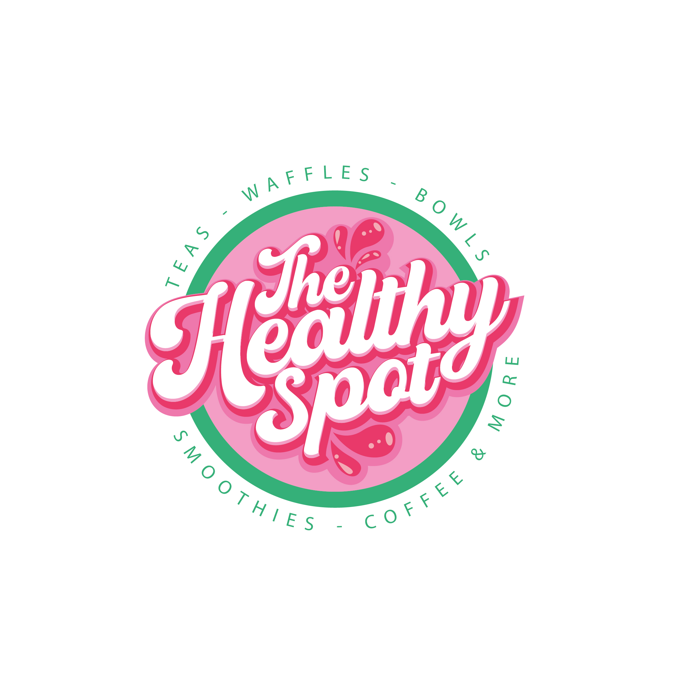
The Healthy Spot Rebranding of Logo
Winner
Want to win a job like this?
This customer received 63 logo designs from 40 designers. They chose this logo design from creativeDAGA as the winning design.
Join for free Find Design Jobs-
 US$150
-
 63 designs
-
 40 designers
Logo Design Brief
Rebranding of current logo. We would like to change colors, font, and make a more playful, fun, dynamic logo. We would like a retro aesthetic vibe and to use the colors pink and orange (maybe some green) as main colors. The Healthy Spot is a smoothie & tea shop focused on protein-based, low calorie, low sugar options.
Target Market(s)
Wellness and fitness enthusiasts, college students, young adults
Industry/Entity Type
Food & beverage, health, wellness, fitness
Logo Text
The Healthy Spot
Logo styles of interest
Emblem Logo
Logo enclosed in a shape
Font styles to use
Decorative
Colors
Colors selected by the customer to be used in the logo design:
00AB8E
00BBA5
67D7C9
C6EFE9
E9F9F6
F0912C
F2A743
F7CA91
FBE8D2
FDF5EE
E54698
E96AAD
F1A4CE
F9D9EA
FCEFF6
Look and feel
Each slider illustrates characteristics of the customer's brand and the style your logo design should communicate.
Elegant
Bold
Playful
Serious
Traditional
Modern
Personable
Professional
Feminine
Masculine
Colorful
Conservative
Economical
Upmarket
Requirements
Must have
- We would like to keep the logo circular / round in shape
Should not have
- Do NOT use our original logo as base for new design
Files
Download all files - 1.6 MBPNG
Original on Transparent
Friday, August 25, 2023
JPG
IMG_2159
Friday, August 25, 2023
JPG
IMG_2156
Friday, August 25, 2023
JPG
IMG_2158
Friday, August 25, 2023
JPG
IMG_2157
Friday, August 25, 2023
JPG
IMG_2155
Friday, August 25, 2023
JPG
IMG_2152
Friday, August 25, 2023
JPG
IMG_2154
Friday, August 25, 2023
Payments
1st place
US$150