Cool bike shop needs a logo refresh with some design flair!
Want to win a job like this?
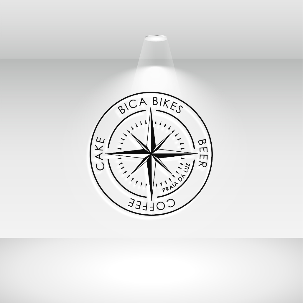
This customer received 125 logo designs from 45 designers. They chose this logo design from 24ksunny as the winning design.
Join for free Find Design Jobs- Guaranteed
-
 €110
€110
-
 125 designs
-
 45 designers
Logo Design Brief
We have the basic idea of a logo that we and our customers like, it was based on a compass with our words replacing the north, east, south, west. It works well as a single colour print but we can go to two if it really makes it stand out. We have it on merchandise that sells really well. For us the current logo layout is adaptable, we have a sensible version for on the shop front and a fun one for t-shirts etc! We need to add our location (Praia da Luz) on it somewhere and it needs more design flair as it was just done by us in a rush when the business opened. If the logo is on its own on a t-shirt it works well but if it is on an advert in a magazine it seems to get lost. The location should be within the design circle.
Updates
Low design quality
Target Market(s)
age group 25 - 65
Industry/Entity Type
Bike shop
Logo Text
As shown on the two logos we uploaded
Logo styles of interest
Abstract Logo
Conceptual / symbolic (optional text)
Font styles to use
Other font styles liked:
- Nexa
Look and feel
Each slider illustrates characteristics of the customer's brand and the style your logo design should communicate.
Elegant
Bold
Playful
Serious
Traditional
Modern
Personable
Professional
Feminine
Masculine
Colorful
Conservative
Economical
Upmarket
Requirements
Must have
- a similar or same layout as it has now.
Nice to have
- a way to switch on/off the location on the logo layout so both work visually
Should not have
- more than two colours