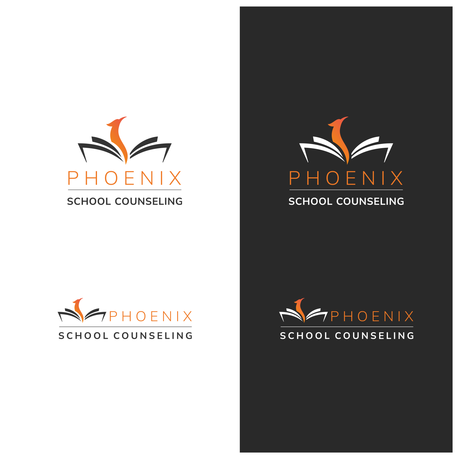
New logo/branding for Phoenix School Counseling - for elementary and middle school
Want to win a job like this?
This customer received 261 logo designs from 116 designers. They chose this logo design from ThiagoB as the winning design.
Join for free Find Design Jobs- Guaranteed
-
 US$150
-
 261 designs
-
 116 designers
Logo Design Brief
Overview:
- Name: Phoenix School Counseling
- Location: Minneapolis-St. Paul metro area, Minnesota
- Target Audience: Non-public elementary, middle schoolers, parents, teachers, students, mental health professionals
Brand Background:
Phoenix School Counseling is a highly regarded counseling service dedicated to enhancing the well-being and educational experience of students in non-public schools across the Minneapolis-St. Paul metro area. Led by Dr. Jules Nolan, a trusted expert in the field, the company offers personalized counseling, engaging presentations, and valuable research-based resources to support parents, teachers, and mental health professionals in creating a thriving learning environment. The name "Phoenix" symbolizes the idea of renewal, growth, and transformation, reflecting the positive impact the counseling services have on the educational community. Although we'd like a very modern, simple, clean, inviting take on a phoenix.
Project Objectives:
1. Design a new logo that captures the essence of Phoenix School Counseling's expertise, compassion, and commitment to supporting non-public schools.
2. Create a brand identity that conveys professionalism, credibility, and approachability, reflecting the company's research-based strategies and resources.
Brand Personality:
- Compassionate
- Trustworthy
- Supportive
- Professional
- Knowledgeable
Design Guidelines:
- Color Palette: Warm and welcoming colors that evoke a sense of comfort, hope, and growth, while also remaining professional. Consider using a mix of calming blues and vibrant, uplifting tones like orange, yellow, or red. Limit the palette to a maximum of five colors.
- Typography: Choose a clean and modern typeface that balances professionalism and approachability. The font should be easily legible and versatile for various applications.
- Imagery: Incorporate modern elements related to the mythical bird "Phoenix" as a symbol of renewal and transformation. Consider subtle phoenix-inspired imagery, but keep it relevant to the counseling context. Integrate imagery related to growth, learning, and support. This could include symbols like open books, sprouting plants, or hands reaching out in support.
- Logo Usage: Ensure the logo is adaptable to different mediums, such as digital, print, merchandise, and presentation materials.
Desired Deliverables:
1. Primary Logo: A unique and impactful logo that embodies Phoenix School Counseling's expertise and commitment to supporting non-public schools.
2. Secondary Logo (optional): A simplified version of the primary logo for use in smaller spaces or as a watermark.
3. Color Palette: Defined set of colors for consistent branding across all materials.
4. Typography: Specified typefaces for use in marketing materials and communications.
Current logo attached - we do not want to keep the color or realism of the phoenix.
Target Market(s)
Non-public elementary, middle, and high schools, parents, teachers, students, mental health professionals
Industry/Entity Type
Mental health/counseling
Logo Text
Phoenix School Counseling
Logo styles of interest
Pictorial/Combination Logo
A real-world object (optional text)
Abstract Logo
Conceptual / symbolic (optional text)
Wordmark Logo
Word or name based logo (text only)
Font styles to use
Colors
Colors selected by the customer to be used in the logo design:
Look and feel
Each slider illustrates characteristics of the customer's brand and the style your logo design should communicate.
Elegant
Bold
Playful
Serious
Traditional
Modern
Personable
Professional
Feminine
Masculine
Colorful
Conservative
Economical
Upmarket
Requirements
Must have
- Modern, light and airy (potentially subtle) elements related to birds - not necessarily a phoenix, we want it to be approachable/soft. Warm and welcoming colors that evoke a sense of comfort, hope, and growth, while also remaining professional.
Nice to have
- Bubbly, fun, approachable colors and lines.
Should not have
- No dark backgrounds. No focus on orange logo or realistic phoenix - should not resemble current logo in that regard.