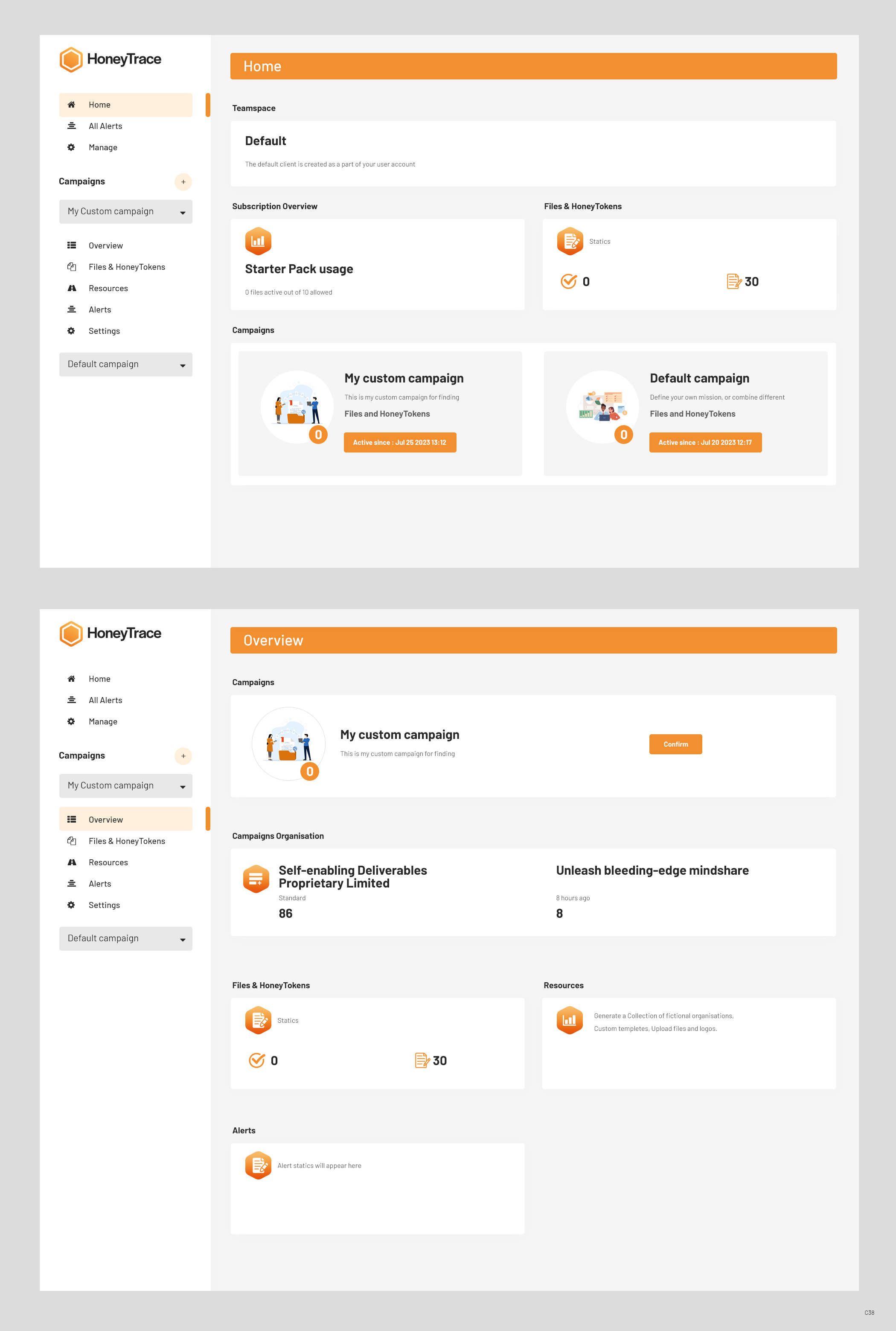
HoneyTrace screens tidy up
Winner
Want to win a job like this?
This customer received 32 web designs from 12 designers. They chose this web design from pb as the winning design.
Join for free Find Design Jobs-
 A$370
A$370
-
 32 designs
-
 12 designers
Web Design Brief
We would like advice on how to better present the following home page and overview pages.
The existing website is functional, but the pages don't appear professionals and pleasing to the eye. We would specifically like feedback on alignment and padding of icons and text to make the screen more appealing and polished.
We are following the carbon design system.
Number of Pages Required
1 page
Font styles to use
Sans Serif
Other font styles liked:
- IBM Plex, Poppins
Look and feel
Each slider illustrates characteristics of the customer's brand and the style your logo design should communicate.
Elegant
Bold
Playful
Serious
Traditional
Modern
Personable
Professional
Feminine
Masculine
Colorful
Conservative
Economical
Upmarket
Files
Download all files - 0.3 MBPNG
Home
Tuesday, July 25, 2023
PNG
overview
Tuesday, July 25, 2023
Payments
1st place
A$330
Participation payments x 4
A$10