Rockford Riptide Swim Team - Logo Redesign
Want to win a job like this?
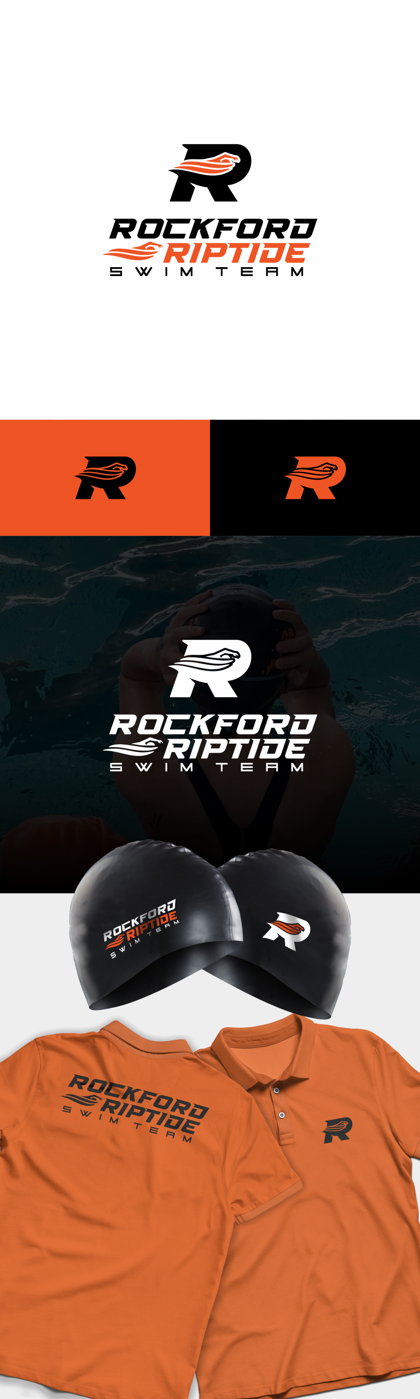
This customer received 115 logo designs from 42 designers. They chose this logo design from yusmoker as the winning design.
Join for free Find Design Jobs- Guaranteed
-
 US$150
-
 115 designs
-
 42 designers
Logo Design Brief
We are looking for a modern, attractive logo for our local swim club, the Rockford Riptide Swim Team. We are in western Michigan and not far from Lake Michigan, hence the allusion to “riptides” or “rip currents,” though including a literal riptide in the design isn't necessary. We are looking to catch the attention of parents and children that may be interested in trying out competitive club swimming.
Our primary color is orange, secondary is a darker blue (though we hardly use it currently), with black and white accents when needed. The local school colors are orange and black (example attached), and we would like to be more unified with the schools as we evolve.
Attached are our current logos: the script logo is what we put on t-shirts, hats, yard signs, etc. The “splash R” is what we put on our swim caps and use as our online logo. We have other, older logos that we never use.
I would like to move away from the messiness of the script logo, but would still like to have the full club’s name included in the design. Definitely a more modern look, but distinct enough to pick out of a crowd.
Please let me know if you have any questions!
Target Market(s)
Parents and children in our community
Industry/Entity Type
sports (swimming)
Logo Text
Rockford Riptide Swim Team
Look and feel
Each slider illustrates characteristics of the customer's brand and the style your logo design should communicate.