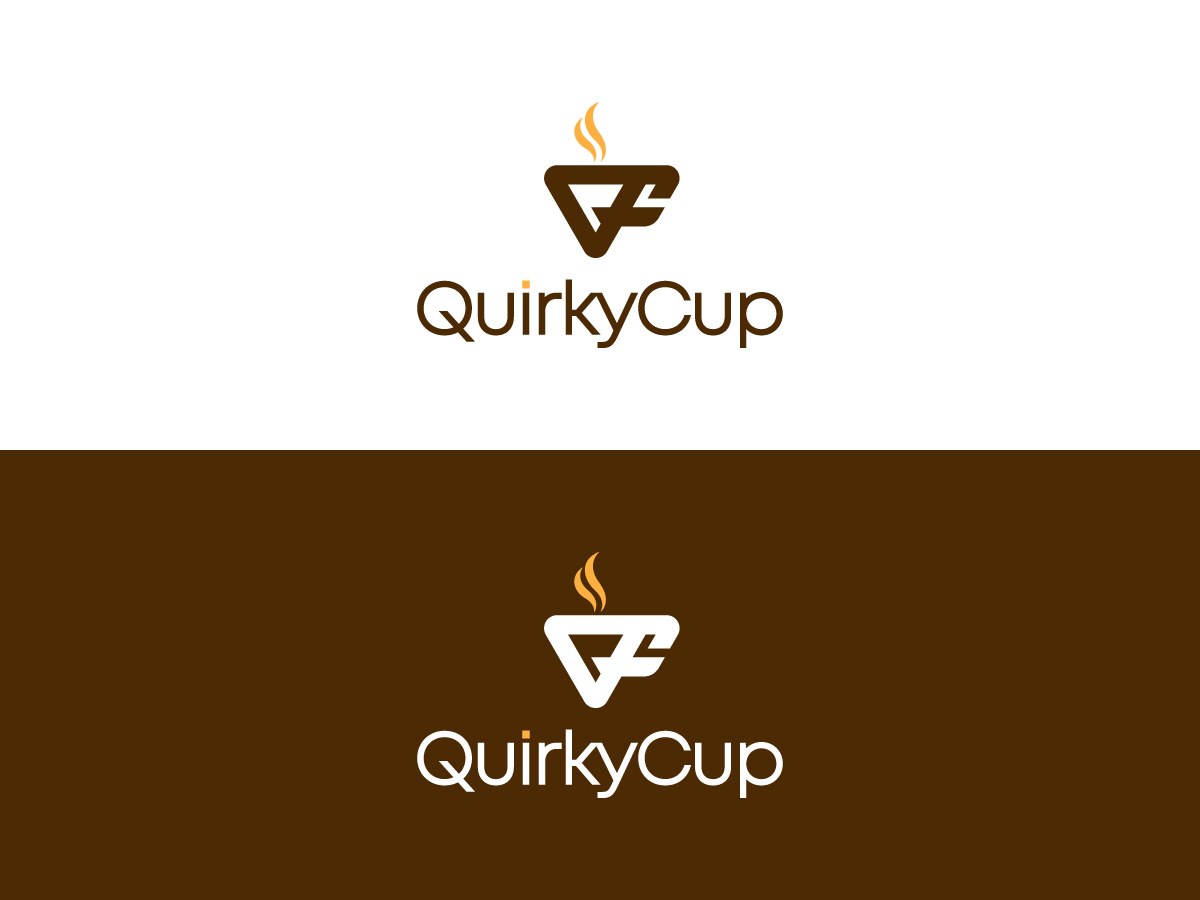
Logo for the coffee mug handle I invented

Want to win a job like this?
This customer received 62 logo designs from 20 designers. They chose this logo design from 439 Creations as the winning design.
Join for free Find Design JobsLogo Design Brief
Background:
Quirky Cup is a startup company that specializes in providing a better-grip mug handles for coffee lovers. I first started working on this problem because I am a robot engineer, and I saw that traditional loop-style coffee mug handles would benefit from the same design principles that are used to make robot grippers. The design is now patented and the mug is really excellent to hold! I attached a PDF of one of the CAD models.
Objectives:
I want to have a wordmark that includes the full name of Quirky Cup in a recognizable way that I can put on the bottom of the mug and people will easily be able to find the website. The wordmark would also go on websites, promotional materials, and packaging.
I also want a symbol or logo. It can include the letters QC but does not need to. It should look good on its own or next to the Quirky Cup wordmark.
Target Audience:
The target audience includes people who enjoy a hot beverage and appreciate products that enhance their experience. The logo should appeal to a wide range of age groups, genders, and beverage preferences.
Competitors:
Many mugs are “commodities” where the mug brand itself is not known and it is decorated with logos of other brands. However, in the overall drinkware space there are lots of brands out there. I think of brands like Yeti and Stanley and Contigo who have premium drinkware and do a good job of creating a recognizable and desirable and differentiated brand.
Quirky Cup wins on having the benefits of a mug (microwaveable, dishwasher safe, insulating) while also having a more excellent grip than any other mug style including traditional loop-style handles.
Brand Personality:
Innovative, Comfortable, Quirky. Trying to strike a balance of being modern and highly functional, while also being cozy and familiar.
One thing I like about our brand is that it doesn’t promise that the grip will be perfect for everyone. Each person has their own unique ways that they like to hold and interact with mugs, and those unique interactions should be celebrated! While Quirky Cup does offer a science-based design that’s proven through testing to be a 3x better hold for all hand sizes, we know that holding a mug is a personal experience and it’s always up to the holder what they love about the experience. What we can promise is that the mug will be Quirky 😊
The logo should convey the message that Quirky Cup offers a unique and innovative solution to improve the grip and comfort of holding a mug, enhancing the overall coffee drinking experience.
Imagery/Iconography ideas:
Incorporate a mug or mug handle element, creatively stylized or abstract. I attached an image of the mug, note that I might make other variations of this style of handle as well, so if the logo includes a mug handle that is based on this shape, please make it abstract enough that I can create variations of it without it clashing with the exact design on the logo.
Explore visual representations of grip, comfort, and innovation.
Consider incorporating subtle visual cues related to coffee or coffee beans, without overwhelming the design.
There might be something interesting in the fact that the “C” and “U” in the word “cup” look like a mug.
I was also inspired by the detail that goes into rock climbing and gripping, so symbols that suggest climbing or aspiring for more are on-brand. I think rock climbers will particularly appreciate the good grip of this mug.
Typography:
Choose a modern and clean font that is easy to read.
Experiment with custom lettering or unique typography to add a touch of quirkiness.
The typography should be legible even when the logo is scaled down.
Color Palette:
Explore vibrant and energetic colors that evoke positive emotions.
Consider warm tones such as oranges, reds, or yellows, but feel free to experiment.
Use colors that stand out and ensure good contrast for maximum visibility.
I don’t have brand colors yet. I will likely set my brand colors based on this logo design.
Style:
Balance simplicity with a touch of creativity and uniqueness.
Explore both flat and slightly dimensional design styles.
Avoid overly intricate details that may be challenging to reproduce in different sizes or applications.
Deliverables:
The deliverable should be a high-resolution wordmark and logo. These should be easily resized and modified for various applications. Include both color and black-and-white versions. Also include the color codes and any stock fonts that are used.
Logo Text
Quirky Cup