Logo Redesign for our School "Fountain College"
Want to win a job like this?
This customer received 161 logo designs from 61 designers. They chose this logo design from Liyana as the winning design.
Join for free Find Design Jobs-
 A$150
A$150
-
 161 designs
-
 61 designers
Logo Design Brief
We would like to redesign (face lift) our existing logo.
We are an independent school in Australia and would like our updated logo to be professional and elegant, while also keeping close to the current logo design and colour.
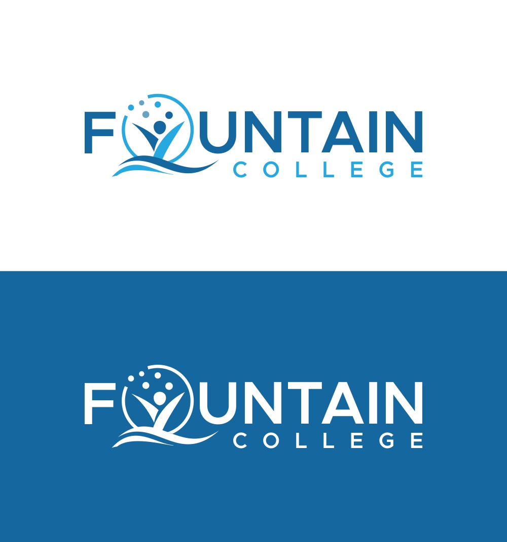
The original name of the school was Damla College, which is a Turkish word meaning "waterdrop." When the school's name was changed to Fountain College, the logo was also changed. The current logo depicts the growth of the school, where waterdrops combine to form a fountain at the bottom of the logo, which is the box shape. The educator then rises through the fountain to spreading wisdom and knowledge, symbolized by the small spheres at the top of the logo.
We would like to maintain this narrative, but the symbols can be different; for example, we do not have to keep the box shape as it is. However, we do not want to deviate too much from the current design. We aim to modernize the logo with a better look by transforming it into a shield-like or circular form, similar to some other school logos. I have attached some examples of shield logos for their reference.
When it comes to colours, we prefer to stick with our blue colour. However, colours that are similar to blue tones may also be acceptable to use.
Updates
Gathering more feedback
The original name of the school was Damla College, which is a Turkish word meaning "waterdrop." When the school's name was changed to Fountain College, the logo was also changed. The current logo depicts the growth of the school, where waterdrops combine to form a fountain at the bottom of the logo, which is the box shape. The educator then rises through the fountain to spreading wisdom and knowledge, symbolized by the small spheres at the top of the logo.
We would like to maintain this narrative, but the symbols can be different; for example, we do not have to keep the box shape as it is. However, we do not want to deviate too much from the current design. We aim to modernize the logo with a better look by transforming it into a shield-like form, similar to some other school logos. I have attached some examples of shield logos for their reference.
When it comes to colours, we prefer to stick with our blue colour. However, colours that are similar to blue tones may also be acceptable to use.
Added Monday, 22 May 2023
Target Market(s)
Parents and Students
Industry/Entity Type
Education
Logo Text
Fountain College
Logo styles of interest
Pictorial/Combination Logo
A real-world object (optional text)
Abstract Logo
Conceptual / symbolic (optional text)
Font styles to use
Colors
Colors selected by the customer to be used in the logo design:
Look and feel
Each slider illustrates characteristics of the customer's brand and the style your logo design should communicate.
Elegant
Bold
Playful
Serious
Traditional
Modern
Personable
Professional
Feminine
Masculine
Colorful
Conservative
Economical
Upmarket
Requirements
Should not have
- Can you avoid using graduation caps as it looks like an alumni logo rather than a school.