Lil' Jay's Family Arcade and Billiards Centre
Want to win a job like this?
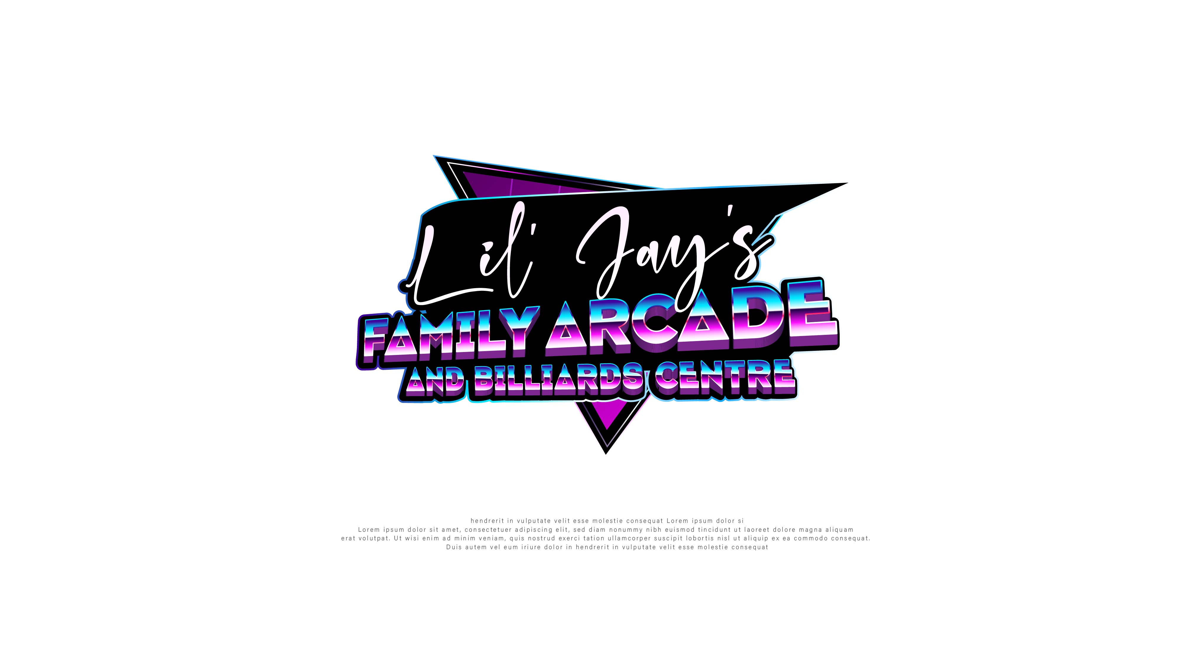
This customer received 37 logo designs from 16 designers. They chose this logo design from Arctic Designs as the winning design.
Join for free Find Design Jobs- Guaranteed
-
 C$120
C$120
-
 37 designs
-
 16 designers
Logo Design Brief
Lil jay can be in 2 different colors and in a thin font with the rest of the words in a thick font. Preferably in black. Lil jay written over top the thick font starting low on the left rising to the top.
The background can be pool balls (either faint or can be bold) , "space invader" charaters (faint or bold). Other video game characters. No Pac-man! He' over used.
80's style colouring may be cool. I wouldn't be apposed. But nothing that makes the name and info too hard to read.
Have fun with it!
Target Market(s)
Ages 6 and up basically. For the whole family.
Industry/Entity Type
Entertainment
Logo Text
Lil' Jay's Family Arcade and Billiards Centre
Logo styles of interest
Wordmark Logo
Word or name based logo (text only)
Font styles to use
Other font styles liked:
- Lil' Jay's" to be diferent from the rest of the rest of the name
Look and feel
Each slider illustrates characteristics of the customer's brand and the style your logo design should communicate.
Elegant
Bold
Playful
Serious
Traditional
Modern
Personable
Professional
Feminine
Masculine
Colorful
Conservative
Economical
Upmarket
Requirements
Must have
- That "POP"! You can pick it out of the crowd. Whether its colour or design or BOTH!
Nice to have
- Video game characters from the 80's and 90's.
Should not have
- Pacman! And spelling mistakes