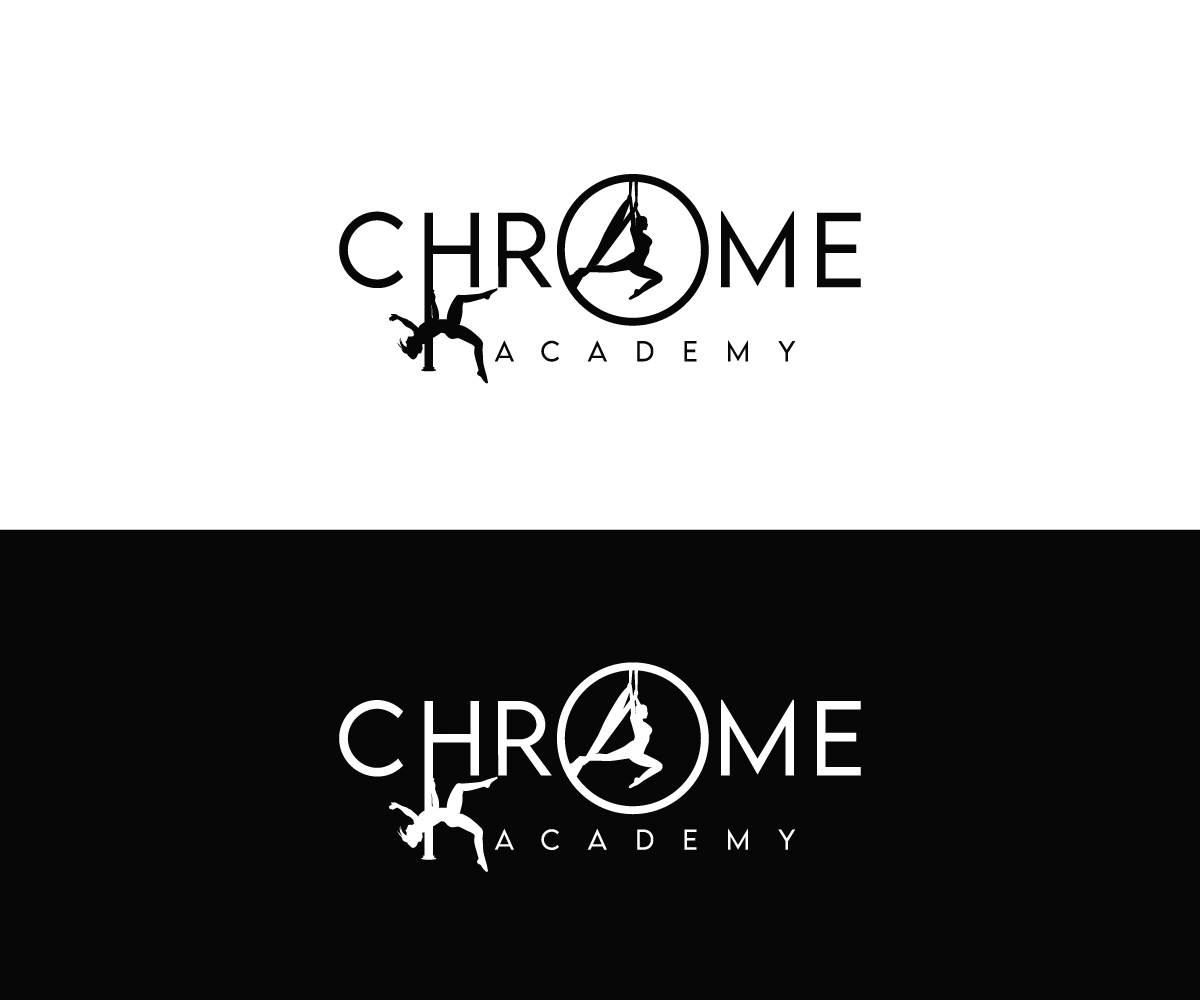
Logo design for pole and aerial studio

Want to win a job like this?
This customer received 98 logo designs from 50 designers. They chose this logo design from step forward 2 as the winning design.
Join for free Find Design Jobs- Guaranteed
Logo Design Brief
I need a logo to be used on a studio wall, website, clothing and business cards. I am opening a new pole and aerial studio, offering sport-focused pole and aerial classes for adults and children. I will also be offering choreography and competition coaching. The studio itself is in a rural setting in the UK, and has been specifically built for pole and aerial - we aim to deliver the highest quality training in a fun and supportive environment! Alongside our regular timetable, we wil be hosting guest instructors for one-off workshops or a range of circus skills. The space is airy with high ceilings (5m!) and will be neutrally decorated with lots of colourful mats, colourful aerial equipment, beanbags and plants. One wall will be completely mirrored and I want to put a big logo on the wall opposite. I would like the name Chrome Academy to be in a text that's easy to read, and would also like a circle to be included somewhere (or for the logo to be in a circle?!) to represent the pole, which is my main skill. I like greyscale and most colours, although I don't overly like too much pink/purple.
Target Market(s)
Adults aged 18-50 (mostly in the 20-40 bracket), children aged 8-16
Industry/Entity Type
Dance and fitness
Logo Text
Chrome Academy
Logo styles of interest
Emblem Logo
Logo enclosed in a shape
Pictorial/Combination Logo
A real-world object (optional text)
Look and feel
Each slider illustrates characteristics of the customer's brand and the style your logo design should communicate.
Elegant
Bold
Playful
Serious
Traditional
Modern
Personable
Professional
Feminine
Masculine
Colorful
Conservative
Economical
Upmarket
Requirements
Must have
- Chrome Academy in a text that is easy to read. Images of pole and aerial hoop / pole and silks / pole, aerial hoop and silks included in the logo.
Nice to have
- A circle somewhere in the design
Should not have
- A completely feminine appearance - we cater for everyone