SUMMIT Group Fitness Studio Logo
Want to win a job like this?
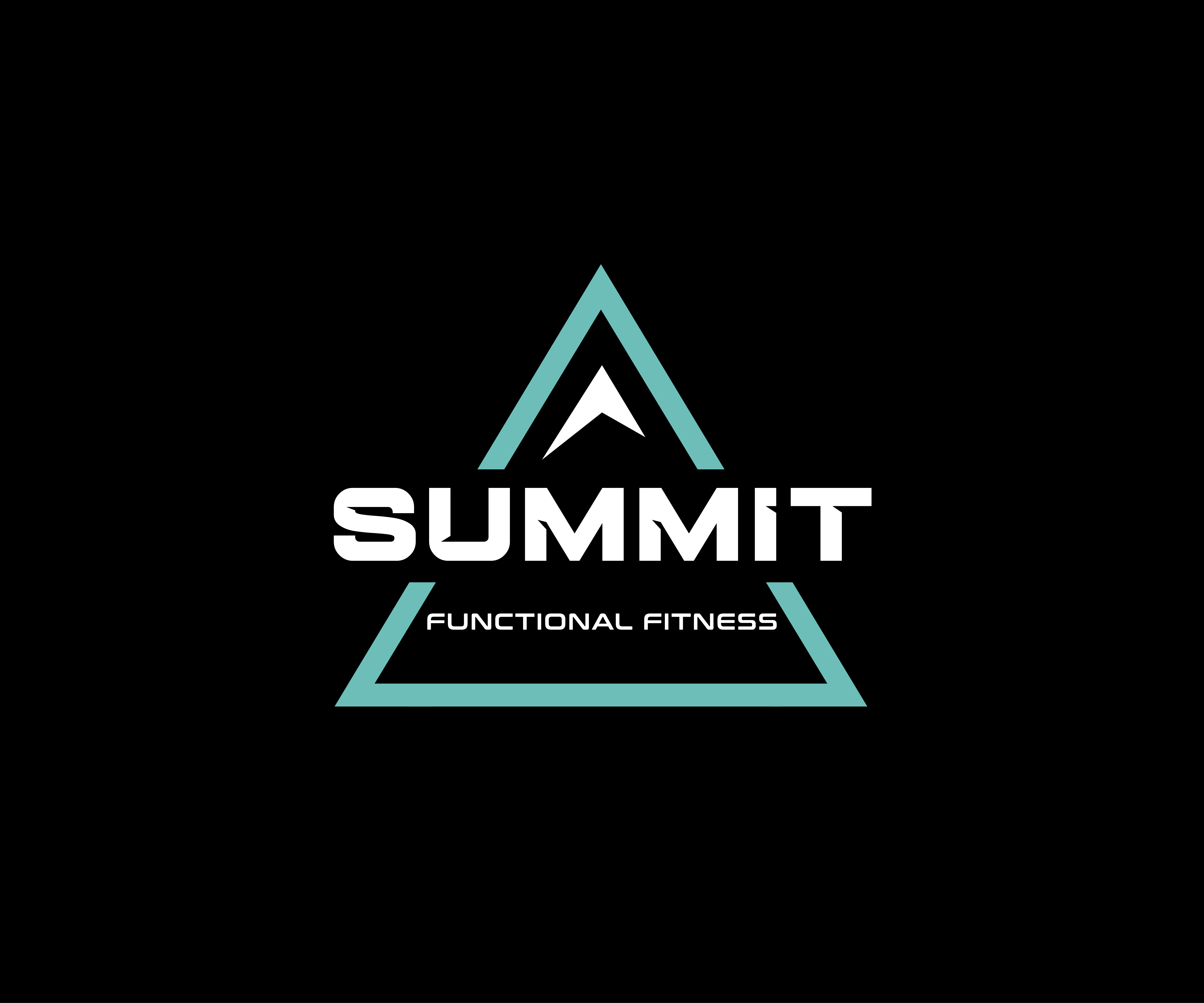
This customer received 26 logo designs from 3 designers. They chose this logo design from James J. as the winning design.
Join for free Find Design Jobs- Guaranteed
-
 £130
£130
-
 26 designs
-
 3 designers
Logo Design Brief
Logo for my fitness studio
Summit is a Group Strength Training facility that welcomes individuals to reach their peak fitness potential, but also those who want to climb back into fitness. It’s the perfect group fitness setting and a perfect solution for those who find gym workouts predictable and repetitive.
Things I don’t like.
1. Over the top fitness logos
2. Outdated logos with Barbells and Dumbells
What I’m after?
Please look at my attachments:
I like the look and set up of
Ski+
Trek
Would it be possible to have something similar with:
SUM
MIT
Then the strap line of Group Fitness somewhere?
Or
Something similar to
The “Summit Series” logo
Colour:
Teal Green, Black, White
Target Market(s)
Group Fitness Enthusiasts of all ages and abilities
Industry/Entity Type
Fitness
Logo Text
SUMMIT GROUP FITNESS
Logo styles of interest
Emblem Logo
Logo enclosed in a shape
Abstract Logo
Conceptual / symbolic (optional text)
Font styles to use
Other font styles liked:
- I have added documents of fonts
Colors
Designer to choose colors to be used in the design.
Look and feel
Each slider illustrates characteristics of the customer's brand and the style your logo design should communicate.
Elegant
Bold
Playful
Serious
Traditional
Modern
Personable
Professional
Feminine
Masculine
Colorful
Conservative
Economical
Upmarket
Requirements
Nice to have
- 1. Keep it Clean 2. Keep it Bold 3.Be Clever
Should not have
- No Actual real images of Mountain. No Cliche images of barbells, dumbbells, fitness figures