Travel Club Softball Team Logo
Want to win a job like this?
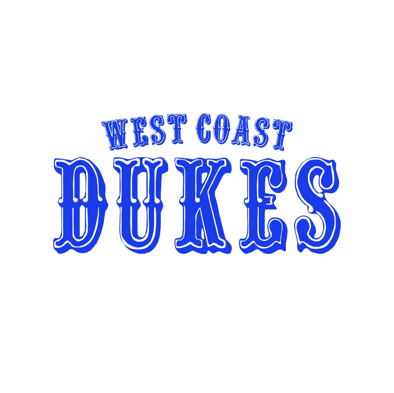
This customer received 175 logo designs from 49 designers. They chose this logo design from Sobisss as the winning design.
Join for free Find Design Jobs- Guaranteed
-
 US$150
-
 175 designs
-
 49 designers
Logo Design Brief
West Coast Dukes is a girls travel softball organization ranging from 10yrs olds to 18 yrs olds student athletes. It is a competitive sport that enables young ladies to develop in the sport of softball and earn a college softball scholarship in the process. Creating life lessons in the process. Most organizations logos are "FIERCE" by design. We are a family based organization would love to use the Shaka symbol somehow.
Updates
“DUKES” using the 49ers font (Quentin Caps). Letter D bigger than UKES and then WESTCOAST (make it look like it was stamped, rectangle around the word WESTCOAST) centered above DUKES.
Added Tuesday, 13 December 2022
Gathering more feedback
Target Market(s)
Softball communities
Logo Text
WESTCOAST exactly like the most recent pic uploaded not filled in with ROYAL blue outline only. DUKES filled in with ROYAL blue and outline in white.
Logo styles of interest
Emblem Logo
Logo enclosed in a shape
Wordmark Logo
Word or name based logo (text only)
Font styles to use
Other font styles liked:
- Quentin Caps
Colors
Colors selected by the customer to be used in the logo design:
Look and feel
Each slider illustrates characteristics of the customer's brand and the style your logo design should communicate.
Elegant
Bold
Playful
Serious
Traditional
Modern
Personable
Professional
Feminine
Masculine
Colorful
Conservative
Economical
Upmarket
Requirements
Must have
- Needs to mirror most recent pic uploaded, but with the logo text updates above. Needs to have the bubbly outline like the 2nd most recent photo I uploaded
Nice to have
- A Logo used for hats and helmets and the name brand for uniforms
Should not have
- NO Shaka. All letters in DUKES need to be the same font size