Construction Company Shirt Logo
Want to win a job like this?
This customer received 76 logo designs from 34 designers. They chose this logo design from Sacril as the winning design.
Join for free Find Design Jobs-
 US$150
-
 76 designs
-
 34 designers
Logo Design Brief
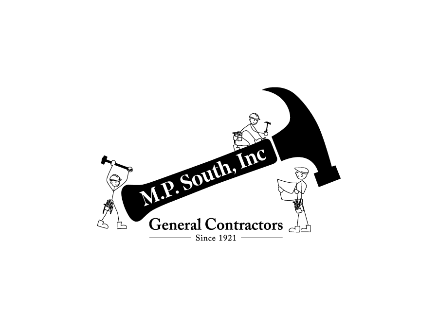
Please see attached is our "original company logo" and our attempted "2021 logo" and "Carpenter Ideas". We would like to make some changes to it. The owner wasn't pleased with our attempted one . It seemed kind of random and didn't flow. His vision is to have the hammer tilted at an angle with our Company name in the hammer. He wants various "old school carpenters" preferably stick figures hanging and working around the hammer. He wants three generations of carpenters (young, middle-aged, and old). Ideas for the carpenters: flat hat for old carpenter, hard hat for young, carpenter tool belts. Please use similar font from the original logo.
Updates
Please make the carpenters in stick figures with DETAILS: Hammer, Carpenters, Flat hat, Tool Belts
Added Tuesday, 15 November 2022
Target Market(s)
Construction
Industry/Entity Type
Construction
Logo Text
M.P. South, Inc. (In hammer) General Contractors (under name or below?) Since 1921 (below)
Logo styles of interest
Pictorial/Combination Logo
A real-world object (optional text)
Abstract Logo
Conceptual / symbolic (optional text)
Look and feel
Each slider illustrates characteristics of the customer's brand and the style your logo design should communicate.
Elegant
Bold
Playful
Serious
Traditional
Modern
Personable
Professional
Feminine
Masculine
Colorful
Conservative
Economical
Upmarket
Requirements
Must have
- DETAILS, Stick figure, Hammer and Carpenters, Flat hat, Tool Belts
Nice to have
- Old School Carpenter
Should not have
- no silhouettes of carpenters