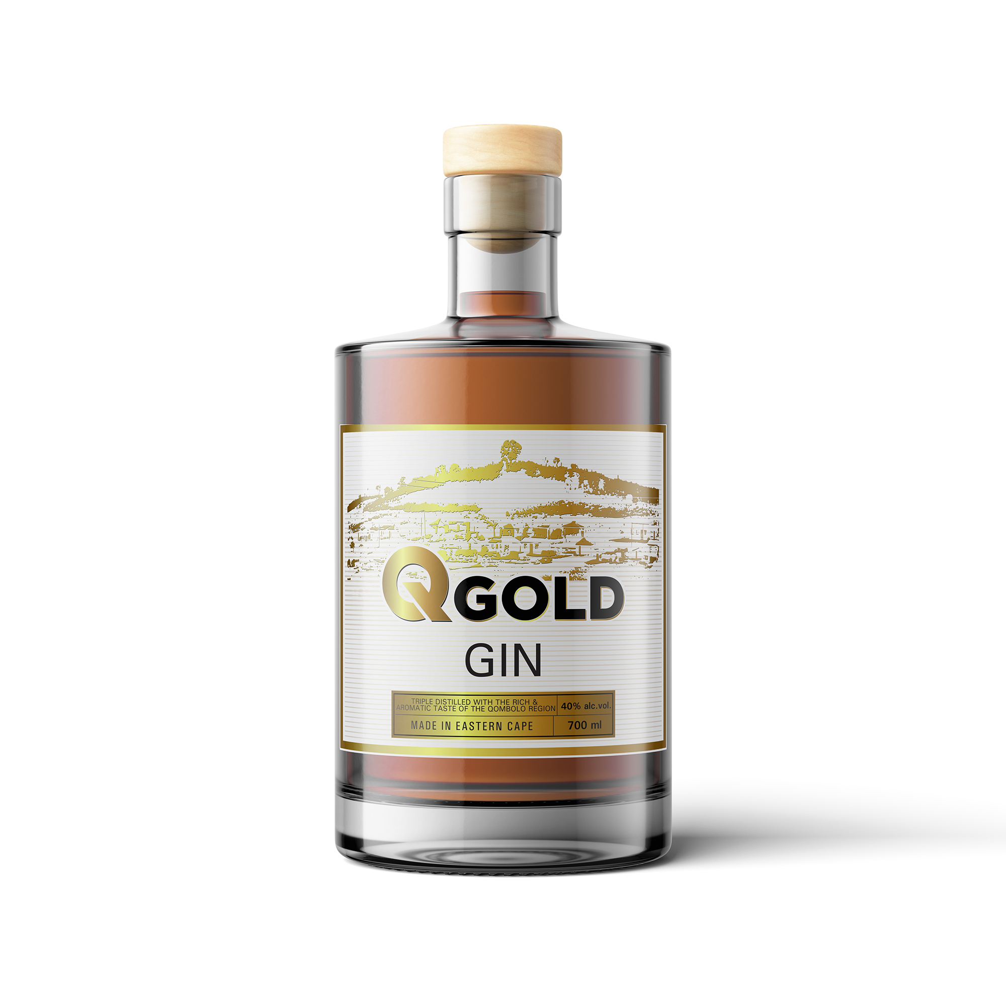
Q.Gold Gin - Bottle label Design
Want to win a job like this?
This customer received 14 label designs from 5 designers. They chose this label design from ronin71 as the winning design.
Join for free Find Design Jobs-
 US$120
-
 14 designs
-
 5 designers
Label Design Brief
We are manufacturers of Gin in South Africa.
The name of our Gin is Q.Gold Gin with Q standing for Qombolo, a Xhosa Village in the region of Eastern Cape.
We would like our brand to depict the following (really the focus of Gold on it)
> Prosperity of the place
> Wealth of the place, land, material or in the people
> Gold rush, potential, hope
As the brand matures, we would like to have campaigns with it. See ideas below:
> Q.Gold Premium
> Black gold edition
Limited edition will be released every year
- Q.Gold estopini (location)
- Q.Gold emlanjeni (location)
> Each batch of bottles with focus on a specific area/location in Qombolo. One that is known and will be highlighted on the map design of the bottle.
Bottles based on landmarks in Qombolo and landmark design in the Big Q.
Below we tried but we are not where we really want to be in terms of Gin Bottle elegance.
Target Market(s)
Target market is the young crowd. Young Xhosa men and women working really hard to get their goals. Positive thinkers. Elegant. Fresh. Bold. Age from 24 to 45. People who enjoy quality products.
Industry/Entity Type
Beverage Industry. Craft Gin.
Font styles to use
Colors
Colors selected by the customer to be used in the logo design:
Look and feel
Each slider illustrates characteristics of the customer's brand and the style your logo design should communicate.
Elegant
Bold
Playful
Serious
Traditional
Modern
Personable
Professional
Feminine
Masculine
Colorful
Conservative
Economical
Upmarket
Requirements
Must have
- Gold colour as a theme. Try and make the background textured.