Bridge Physical Therapy & Wellness Logo
Want to win a job like this?
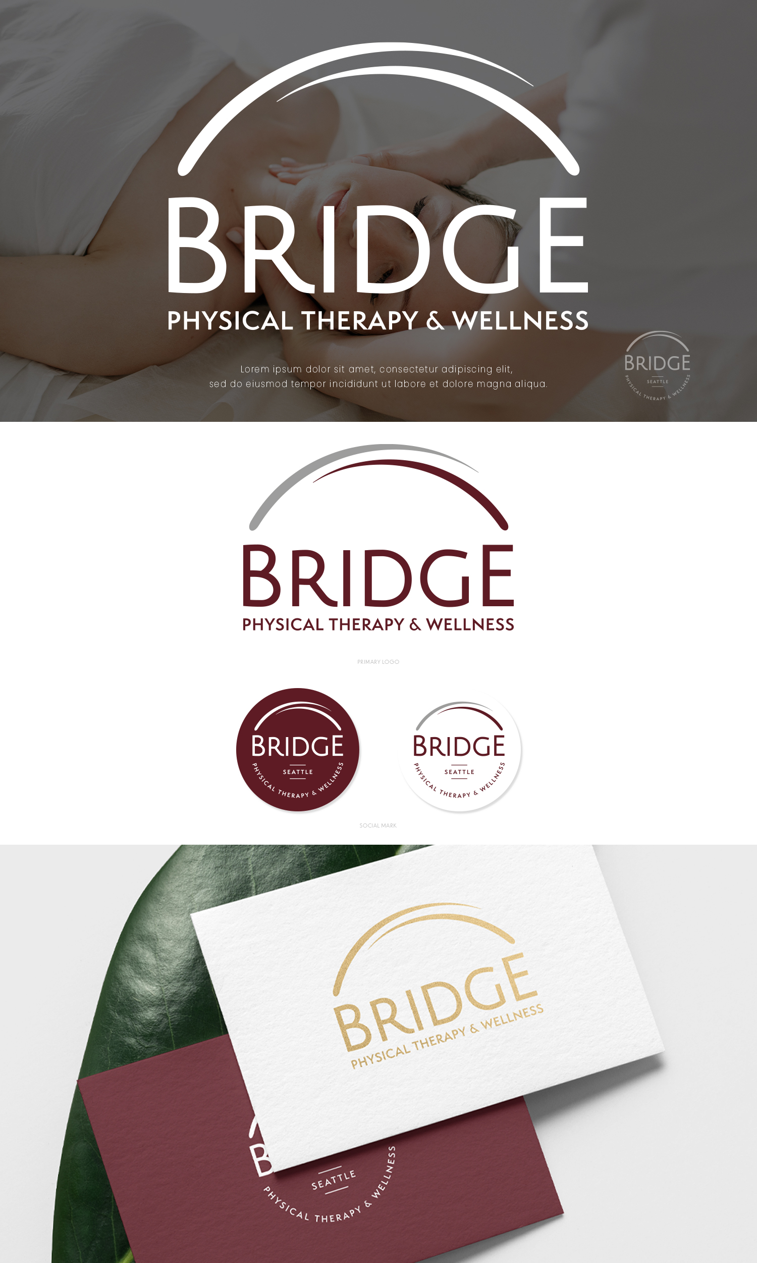
This customer received 121 logo designs from 63 designers. They chose this logo design from Modeform as the winning design.
Join for free Find Design Jobs-
 US$150
-
 121 designs
-
 63 designers
Logo Design Brief
We are a new boutique physical therapy practice in an affluent suburb of Seattle, founded and run by three local women. Most of our clients pay out of pocket to see us. We believe we offer premium treatment and concierge level customer service. We created our own temporary logo and now we would like a professional to take what we made and translate it into a more usable format, make it a little bolder and make the graphic look more like paint brush strokes. We want a feminine, modern and clean looking logo. We like the fonts we already chose, so we are hoping for something with a similar look, perhaps just something a little more bold or thick, but same style. Our colors are maroon with white and black. Shades of grey ok too.
Target Market(s)
Adults 30-50 years who are high level or high achieving executives or professional from households earning >$100k
Industry/Entity Type
Healthcare, Physical Therapy
Logo Text
Bridge Physical Therapy & Wellness
Logo styles of interest
Abstract Logo
Conceptual / symbolic (optional text)
Font styles to use
Look and feel
Each slider illustrates characteristics of the customer's brand and the style your logo design should communicate.
Elegant
Bold
Playful
Serious
Traditional
Modern
Personable
Professional
Feminine
Masculine
Colorful
Conservative
Economical
Upmarket
Requirements
Must have
- A modern, contemporary look
Nice to have
- 2-3 abstract arcs that convey the image of a bridge, movement and essence of flowing water
Should not have
- something that looks like a corporate or stock logo