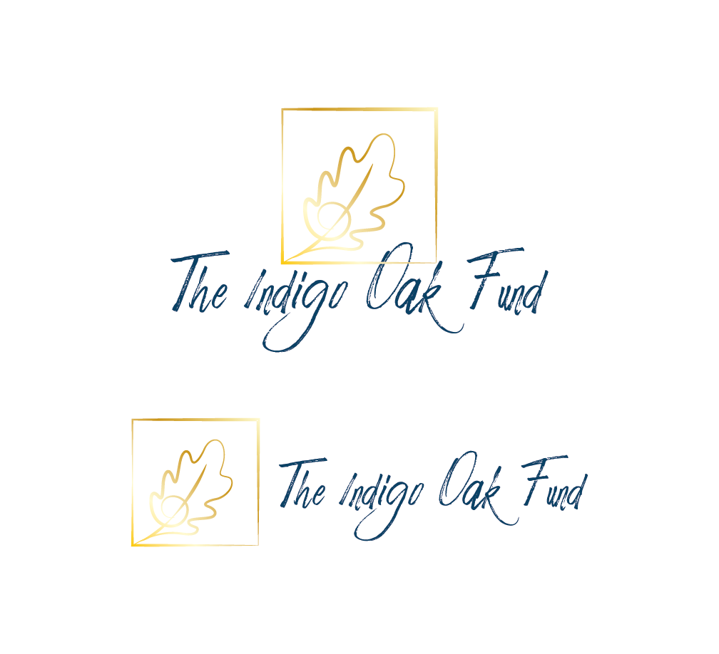
Logo design for The Indigo Oak Fund
Want to win a job like this?
This customer received 126 logo designs from 37 designers. They chose this logo design from hlDes as the winning design.
Join for free Find Design Jobs- Guaranteed
-
 US$150
-
 126 designs
-
 37 designers
Logo Design Brief
The Indigo Oak Fund is a private family foundation. Focus areas are education, the arts, women and children, and equal justice under the law. Logo needed for website, print materials, posters, business cards, etc.
Would like design to be graceful and sophisticated. Do NOT find most of the “stock” oak tree images very attractive. Would like more stylized, but not too abstract.
Perhaps script font, but script “I” must not be mistaken for “T” like in many fonts.
Colors: Flexible, but like idea of dark blue as one of shades used. Also like concept of gold embossing highlight option for letterhead and business cards, with ability to maintain logo integrity if logo reproduced without gold option (similar non-metallic color?).
Target Market(s)
Non-profit organizations seeking funding from The Indigo Oak Fund.
Industry/Entity Type
Private Family Foundation
Logo Text
The Indigo Oak Fund
Logo styles of interest
Pictorial/Combination Logo
A real-world object (optional text)
Font styles to use
Look and feel
Each slider illustrates characteristics of the customer's brand and the style your logo design should communicate.
Elegant
Bold
Playful
Serious
Traditional
Modern
Personable
Professional
Feminine
Masculine
Colorful
Conservative
Economical
Upmarket
Requirements
Must have
- Oak tree (stylized or elegant design)
Nice to have
- The Fund is a charitable organization providing gifts to non-profit groups in areas of education, arts, women and children, and equal justice under the law.
Should not have
- Do not care for blocky, bold “in your face” logos like many of the sports brands, etc. want it to be distinctive but sophisticated.