Logo Design for Rebranding of Public Relations Company
Want to win a job like this?
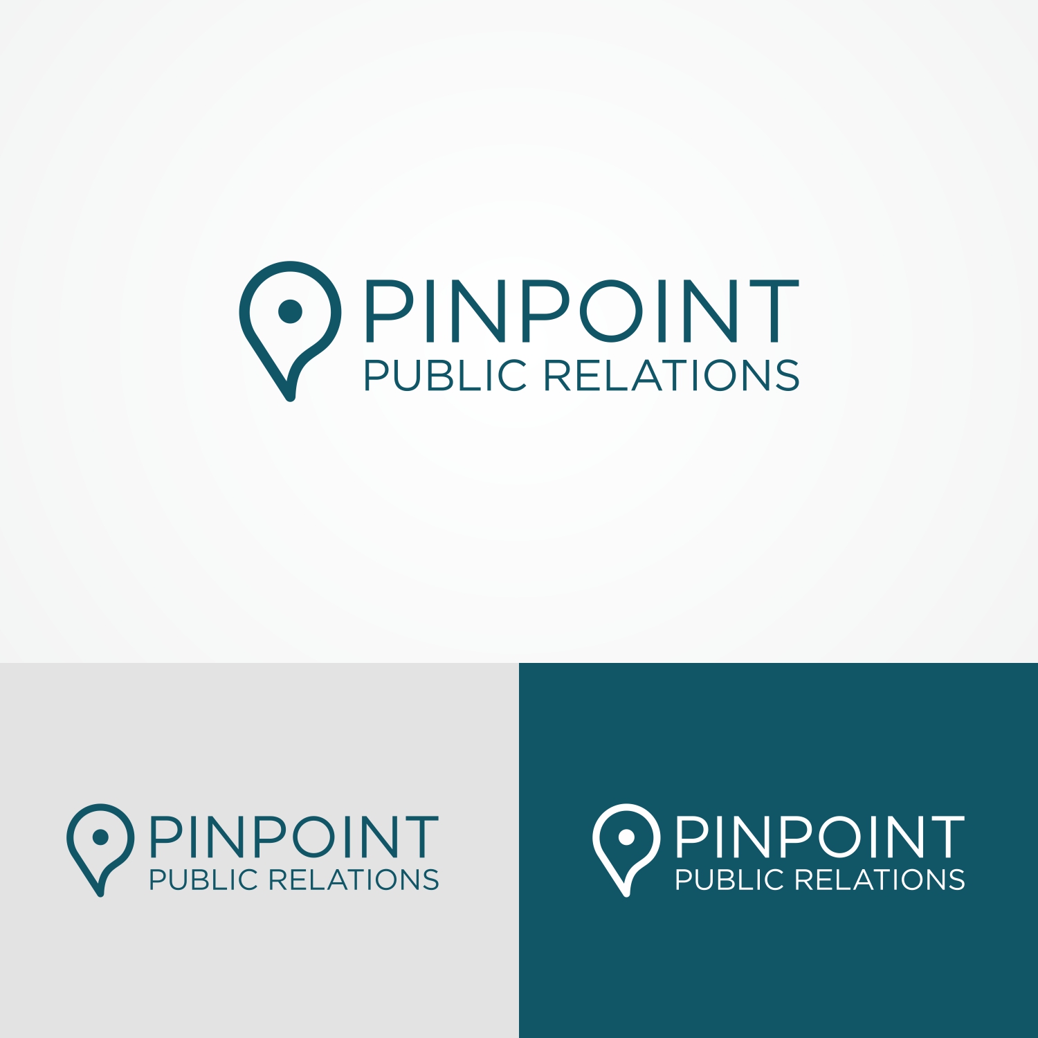
This customer received 92 logo designs from 43 designers. They chose this logo design from B8 as the winning design.
Join for free Find Design Jobs- Guaranteed
-
 US$150
-
 92 designs
-
 43 designers
Logo Design Brief
We plan to rebrand and need a logo. We are a public relations firm based in Indianapolis, IN. We manage all types of communications initiatives for clients such as press release writing, media pitching, media training, media monitoring, social media, thought leadership and content writing for blogs, websites and newsletters. Our current company name is Holsapple Communications and while we'd like the name to change, we want to keep our colors the same. I have attached our current logo for reference. The exact colors are:
CMYK for all lettering
C 94
M 57
Y 47
K 28
Light teal
C 87
M 39
Y 36
K 0
We are also a women-owned business. We pride ourselves on being sophisticated and classy but we also have fun and are creative. We do not want a logo that is girlie or flowery, but something with a feminine touch would be nice.
Target Market(s)
We work with businesses in industries ranging from real estate, health care, finance, non profit, education and more. We typically work with clients in the Midwest, specifically Indiana and Ohio
Industry/Entity Type
Public Relations
Logo Text
Pinpoint Public Relations
Logo styles of interest
Abstract Logo
Conceptual / symbolic (optional text)
Wordmark Logo
Word or name based logo (text only)
Lettermark Logo
Acronym or letter based logo (text only)
Font styles to use
Colors
Colors selected by the customer to be used in the logo design:
Look and feel
Each slider illustrates characteristics of the customer's brand and the style your logo design should communicate.
Elegant
Bold
Playful
Serious
Traditional
Modern
Personable
Professional
Feminine
Masculine
Colorful
Conservative
Economical
Upmarket
Requirements
Must have
- My project must have the colors I mentioned, the name "Pinpoint Public Relations" and a catchy logo mark
Nice to have
- We like when letters are hidden (see currently logo as an example)
Should not have
- My project must not have girlie or flowery