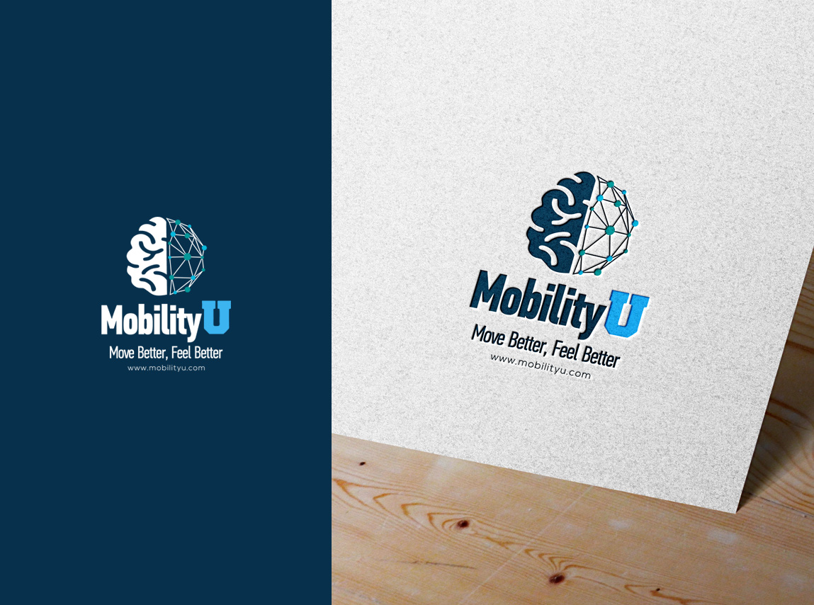
Brand Logo for a neural based movement practice
Winner
Want to win a job like this?
This customer received 105 logo designs from 55 designers. They chose this logo design from nikkiblue as the winning design.
Join for free Find Design Jobs- Guaranteed
-
 US$179
-
 105 designs
-
 55 designers
Logo Design Brief
Logo design for a rehab, strength and conditioning practice. We specialize in neural (brain) connection to make movements more efficient. Posture and breathing are a huge focus bc we are very distracted. The "U" is for university. I have a huge focus on educating my clients so they become their own teachers
Target Market(s)
general population, athletes, rehab
Industry/Entity Type
health, wellness, hollistic
Logo Text
Mobility U - move better feel better (maybe small font under)
Colors
Colors selected by the customer to be used in the logo design:
0054AA
0677BA
7BADD7
CADEEF
E8F1F8
Look and feel
Each slider illustrates characteristics of the customer's brand and the style your logo design should communicate.
Elegant
Bold
Playful
Serious
Traditional
Modern
Personable
Professional
Feminine
Masculine
Colorful
Conservative
Economical
Upmarket
Requirements
Must have
- "U" University, like upload photo, incorporating the helix shape
Nice to have
- professional look, brain body connection
Files
Download all files - 2.7 MBJPG
U
Wednesday, October 27, 2021
PNG
Screenshot (2)
Friday, November 5, 2021
PNG
Screenshot (1)
Friday, November 5, 2021
Payments
1st place
US$110
Participation payments x 1
US$69