Petal Electrolysis Logo Design
Want to win a job like this?
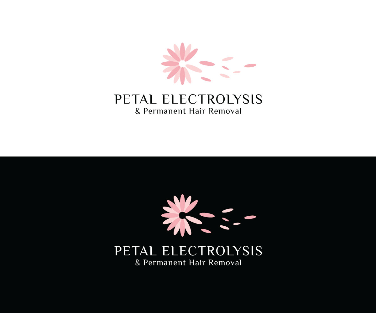
This customer received 58 logo designs from 34 designers. They chose this logo design from Iris 3 as the winning design.
Join for free Find Design Jobs- Guaranteed
-
 C$150
C$150
-
 58 designs
-
 34 designers
Logo Design Brief
So the color that represents the business best is BLUSH PINK (very light, softer pink) . NOT fuchsia or Bright or Neon . Also WHITE/BLACK and the full range of different SKIN/HAIR TONES from WHITE to DARK BROWN.
The feeling I want customers to feel as they look at the logo is CONFIDENT, BEAUTIFUL, PRIDE in BODY IMAGE, SOFT , SMOOTH, DEWEY, SAFE, WELL CARED FOR, PROFESSIONAL, CLEAN, CALM
Fonts ARIMA MADURAI, YESEVA ONE, LAILA
The reason was that these are easy to read yet still have a slight elegant, flow, script quality. Stronger bold lettering with smooth quality - Confident feminine quality.
The Petal is not essential. I like petals & flowers however and I feel that they represent the soft , dewy, smooth feel of hairless skin. I also think it could link the name to the logo. The colors of flowers or petals also match the representative color of the business. I don’t like the bold look of a full flower however- I like the hint of a petal or flower- not necessarily the entire image. However I am open to interpretive representations.
Target Market(s)
Men and Women who need hair removal
Industry/Entity Type
Hair Removal
Logo Text
Petal Electrolysis & Permanent Hair Removal
Logo styles of interest
Pictorial/Combination Logo
A real-world object (optional text)
Wordmark Logo
Word or name based logo (text only)
Font styles to use
Other font styles liked:
- ARIMA MADURAI, YESEVA ONE, LAILA
Colors
Colors selected by the customer to be used in the logo design:
Look and feel
Each slider illustrates characteristics of the customer's brand and the style your logo design should communicate.
Elegant
Bold
Playful
Serious
Traditional
Modern
Personable
Professional
Feminine
Masculine
Colorful
Conservative
Economical
Upmarket
Requirements
Must have
- "Petal Electrolysis" should be the main logo text, with the "& Permanent Hair Removal" as a sub text
Nice to have
- So the color that represents the business best is BLUSH PINK (very light, softer pink) . NOT fuchsia or Bright or Neon . Also WHITE/BLACK and the full range of different SKIN/HAIR TONES from WHITE to DARK BROWN. The feeling I want customers to feel as they look at the logo is CONFIDENT, BEAUTIFUL, PRIDE in BODY IMAGE, SOFT , SMOOTH, DEWEY, SAFE, WELL CARED FOR, PROFESSIONAL, CLEAN, CALM Fonts ARIMA MADURAI, YESEVA ONE, LAILA The reason was that these are easy to read yet still have a slight elegant, flow, script quality. Stronger bold lettering with smooth quality - Confident feminine quality. The Petal is not essential. I like petals & flowers however and I feel that they represent the soft , dewy, smooth feel of hairless skin. I also think it could link the name to the logo. The colors of flowers or petals also match the representative color of the business. I don’t like the bold look of a full flower however- I like the hint of a petal or flower- not necessarily the entire image. However I am open to interpretive representations.