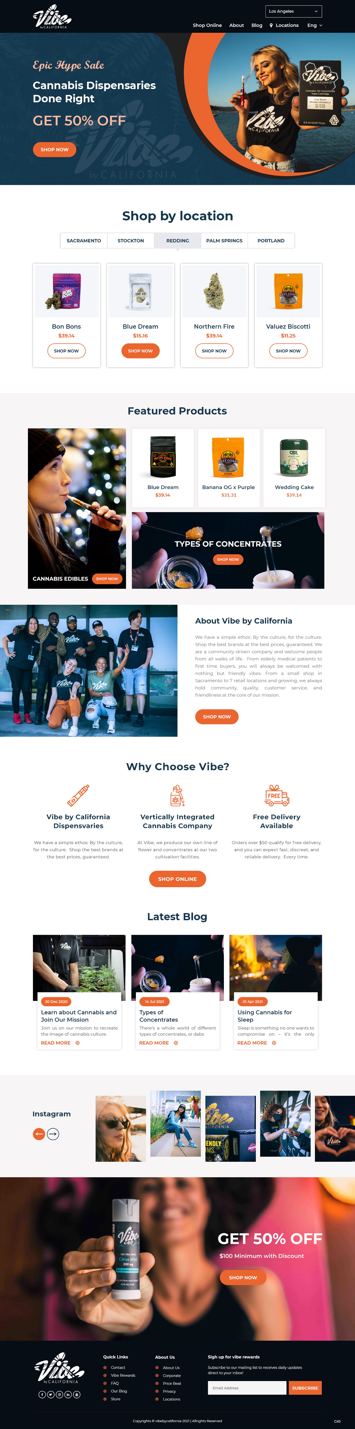
UI Enhancements for California Cannabis Dispensary
Want to win a job like this?
This customer received 21 Wordpress designs from 3 designers. They chose this Wordpress design from pb as the winning design.
Join for free Find Design Jobs-
 C$370
C$370
-
 21 designs
-
 3 designers
Wordpress Design Brief
We are looking to update the UI of our existing website to reflect our brand colors, and ethos on our website www.vibebycalifornia.com. We would like to improve the shopping UX by redirecting users to their appropriate store. The iframes for our online storefronts are attached, and must be organized so that the user easily finds their correct store using both menu navigation and geo-based redirects. The redirects should redirect users only once, to avoid restricted access to other stores.
We want the design to be cohesive across all pages, and we want to use Geo-based redirects to direct the user to the appropriate store and provide them with a location icon in the navigation menu to search and select other stores. Our brand color is orange, please see attached color palette for exact and complimentary colors.
The design will need to be created using the WordPress Salient theme and on page SEO should be respected (Headers, content, alt text, etc.).
Target Market(s)
Cannabis Consumers between 24-35
Industry/Entity Type
Cannabis
Font styles to use
Other font styles liked:
- Montserrat
Colors
Colors selected by the customer to be used in the logo design:
Look and feel
Each slider illustrates characteristics of the customer's brand and the style your logo design should communicate.
Elegant
Bold
Playful
Serious
Traditional
Modern
Personable
Professional
Feminine
Masculine
Colorful
Conservative
Economical
Upmarket
Requirements
Must have
- Dutchie Store iFrames (attached), Geo-based Redirects, Salient Theme, Location Icon on navigation menu to select store, Cohesive brand colors
Nice to have
- Heavily shopping based. Use Photos from our Portfolio: https://bit.ly/37MxbR5
Should not have
- Changes in <H1 - H4> headers or changes to existing copy