Herbal Apothecary Rebrand
Want to win a job like this?
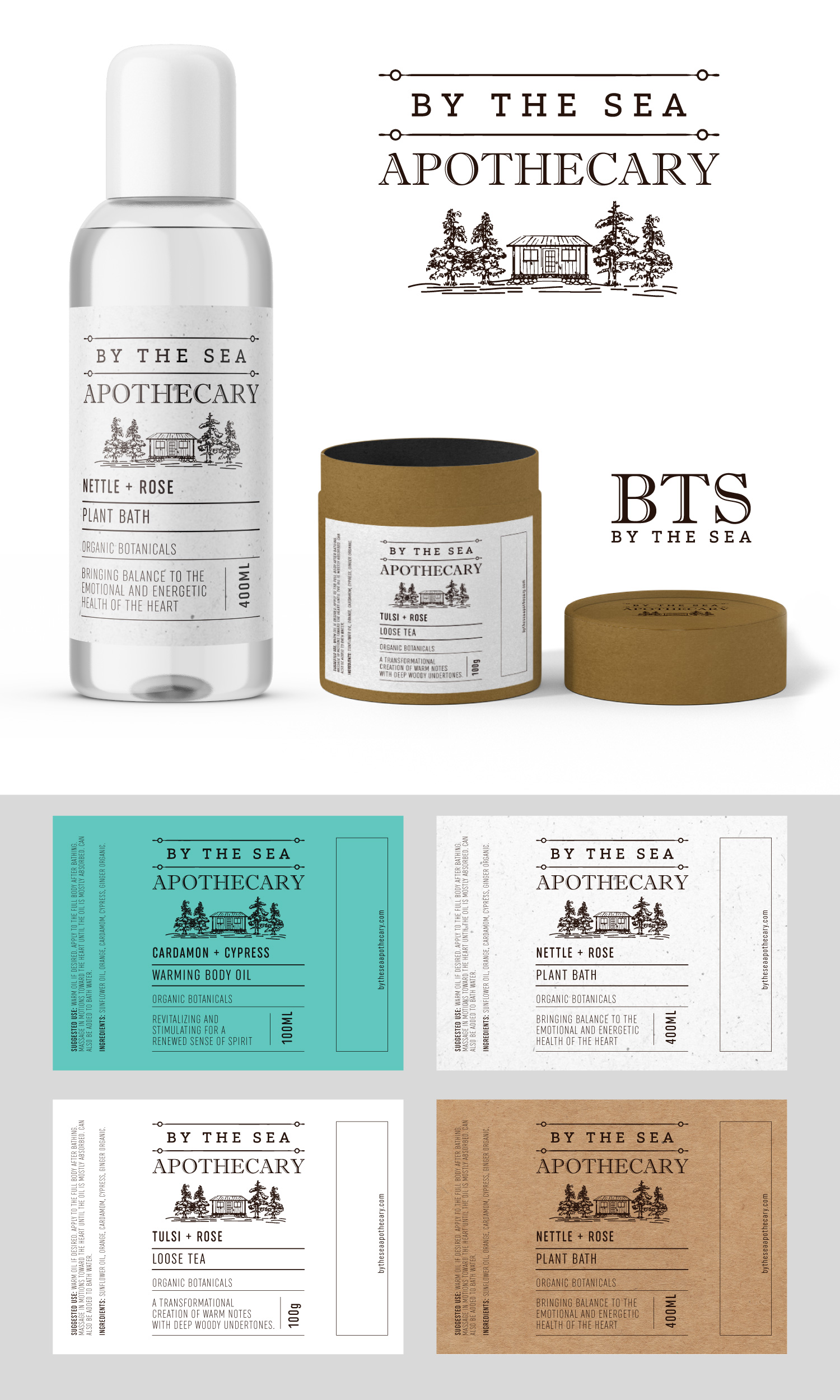
This customer received 66 label designs from 20 designers. They chose this label design from Sergio Coelho as the winning design.
Join for free Find Design Jobs- Guaranteed
-
 C$300
C$300
-
 66 designs
-
 20 designers
Label Design Brief
I am in the process of merging two companies Bear Essential Oils and By The Sea Apothecary. I am dissolving Bear Essential Oils (BEO) and need to blend a few of the products into the By The Sea Apothecary (BTS) line. These blended products will take on a fresh new look. This is where I need some help. I have a few ideas but need some creative genius to bring them together.
The following products need to be merged and once a logo is agreed upon I will be working with this designer with further pay to create the following:
~ body oils (labels and packaging) **existing product shown in image A-1
~ plant bath medicines (labels and packaging) **a new product with the bottle and packaging shown in images attached
~ facial serum (labels and packaging - the packaging will be the same cardboard boxes used for the body oils) **existing product shown in
image A-2
~ teas (labeling) **a new product - packaging sample pics attached
~ as well as having the ability to carry over into the creation of 40 different essential oil containers. ** An idea I have is shown in image C-1.
Ideas...
I prefer distinct lines, square designs vs circular or curvy. I prefer clean and clear vs busy.
I like the layout shown in images A-1 & A-2 and could see moving forward with a very similar style without the indigenous logo. I would like to see what it looks like to have the BTS logo (building with trees) in place of the indigenous logo. ** I am open to reworking the BTS logo to make it a bit more vertical in size vs being quite small and horizontal. This could include revising or recreating the building and trees altogether.
I like the speckled background (shown in image B-1), it gives the sense that it is aged and goes with the Apothecary theme, however I'm not completely attached to it.
I like the off white labels that I currently have for the BODY OILS and the SERUM and I am leaning towards this as the colour for the new blended line. I would also be open to seeing a lighter version of the turquoise.
This is just an idea that I have however I am open to something completely new. What is important is that it blends nicely with the current line of products available at BTS (the entire line can be seen online). There is a good chance that I will be merging the products over to the new and improved design as we move through the older packaging.
Notes on Plant Bath labels:
**If working from the current layout of the Body Oil labels this can be used as an example to create a template
~ The top will have the new or reworked logo (with or without the company name depending on space available)
~ First line for each bottle will have a name eg: NETTLE + ROSE
~ Second line will be the purpose of the medicine eg: HEART OPENING
~ The next line will read: PLANT BATH
~Then space for a little blurb eg: BRINGING BALANCE TO THE EMOTIONAL AND ENERGETIC HEALTH OF THE HEART.
~ The size of the bottle will read 400 ML but in a vertical direction on the bottle
Notes on Tea labels:
The teas have not been created yet but I'm looking for some ideas that follow in the same design as the Plant Bath labels so the following can be used as an example:
~ Name; TULSI + ROSE
~ The purpose: ELEVATED HEART
~ The bottom will read: LOOSE TEA
~ Blurb about the benefits: A TRANSFORMATIONAL CREATION OF WARM NOTES WITH DEEP WOODY UNDERTONES. THIS ANYTIME TEA IS AS PLEASING IN THE HEALTH BENEFITS AS IT IS TO THE TASTE.
~ Include the size: 100g
**I maxed out in pictures so I wasn't able to add more inspiration pics but I also quite like the stone & grove tea line (shows up in a google search) as its clean and clear. The difference being I won't be printing directly on the packaging, it will need to be a label.
Logo Text
I would like to see if we can incorporate the name BY THE SEA APOTHECARY however this might make it too busy. Perhaps smaller lettering for "by the sea" and larger for "APOTHECARY". It also might be the case that adding this on the front makes things look too busy. I'm open to creative suggestions.
Font styles to use
Look and feel
Each slider illustrates characteristics of the customer's brand and the style your logo design should communicate.