FlowWorks project
Want to win a job like this?
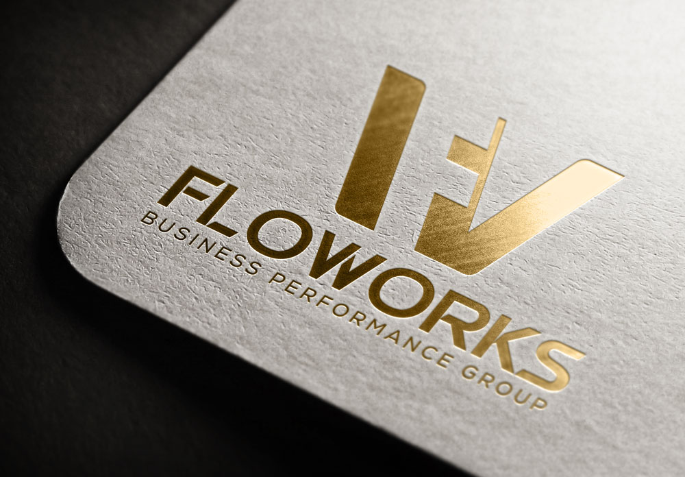
This customer received 49 logo designs from 20 designers. They chose this logo design from othoisagor as the winning design.
Join for free Find Design Jobs- Guaranteed
-
 A$150
A$150
-
 49 designs
-
 20 designers
Logo Design Brief
CALLING ALL DESIGNERS WHO LOVE FLOW
ESSENTIAL
needs to appeal to entrepreneurial world,
needs to denote something 'stable' and
something that denotes a strong base
something with an academic edge (font)
We need a logo design for our company Flow Works---we teach companies to work in flow and solve their Human Resources inefficiencies
(as reader of this you would already know flow---ever time you do a great design you were in flow)
Our customer is a highly innovative company so edgy designs that draw the young or the young-at-heart corporate CEO's or leaders
Our customer are also individuals who are interested in creativity in action
Logo Summary Colour
Colour’s Black, Green, and Gold
Colour reckoning
• Green donates go and go forward
• Black is the position of profit and results on a measured P&L
• Gold is the operating level of the business and employees in Flow
WANT ANY DESIGNER THAT LOVES FLOW TO SHOW THEIR OWN TAKE ON THE UPLOADED LOGO
(So we want all the essentials that is in the loggo----but the font, the way the circles look or are drawn is up to you)
More Background INFO (if you are FEELING THE FLOW)
The Green and gold also reflects the origin of FlowWorks in Australia, as these colours used predominantly in the international arena of represented sports and competition at the highest level.
A level were the team needs to be at its absolute best in balancing skills and challenges at this elite level.
These colours are instantly recognisable, and sub linked to a winning culture and national pride.
Logo Summary definition
The gold circles are progressed in size from small to large in moving forward and up the black line that represents the business and people’s performance as required in expectation.
The first gold circle represents the start in introducing Flow, a new way to work
The second gold circle represents an achievement in FlowWorks of functional acceptable employees
The third gold circle represents an achievement in FlowWorks exceptional employees
The black arrow protruding out of the exceptional circle is the continued work growth of the business and employees from the legacy of Flowworks
The 2 Green lines moving up represent the lines of skills and challenges and is the working framework encompassing the black lines of results with the progressive gold circles as consequence to our work.
The gold circle in the FlowWorks “o” represents our commitment and faith in the product and outcomes and is linked to the standard we set for the business in commercial and personal outcomes.
So, on feedback this will form the logo seen on our Email signatures, letter head, banners business cards, web brochures and apparel.
It is important that we like and associated with it and has meaning and purpose and that our clients can associated with it also, importantly it tells, and we can tell the story of it as a visual reckoner to
Updates
The team has deemed that we want to drop a 'W' from the name so that the logo is simpler...so could designers kindly amend to 'Floworks' We look forward to your designs...so much love for the one's already submitted
Logo Text
FlowWorks_(subtex)Business Performance Group