

 Refresh
 our logo
Want to win a job like this?
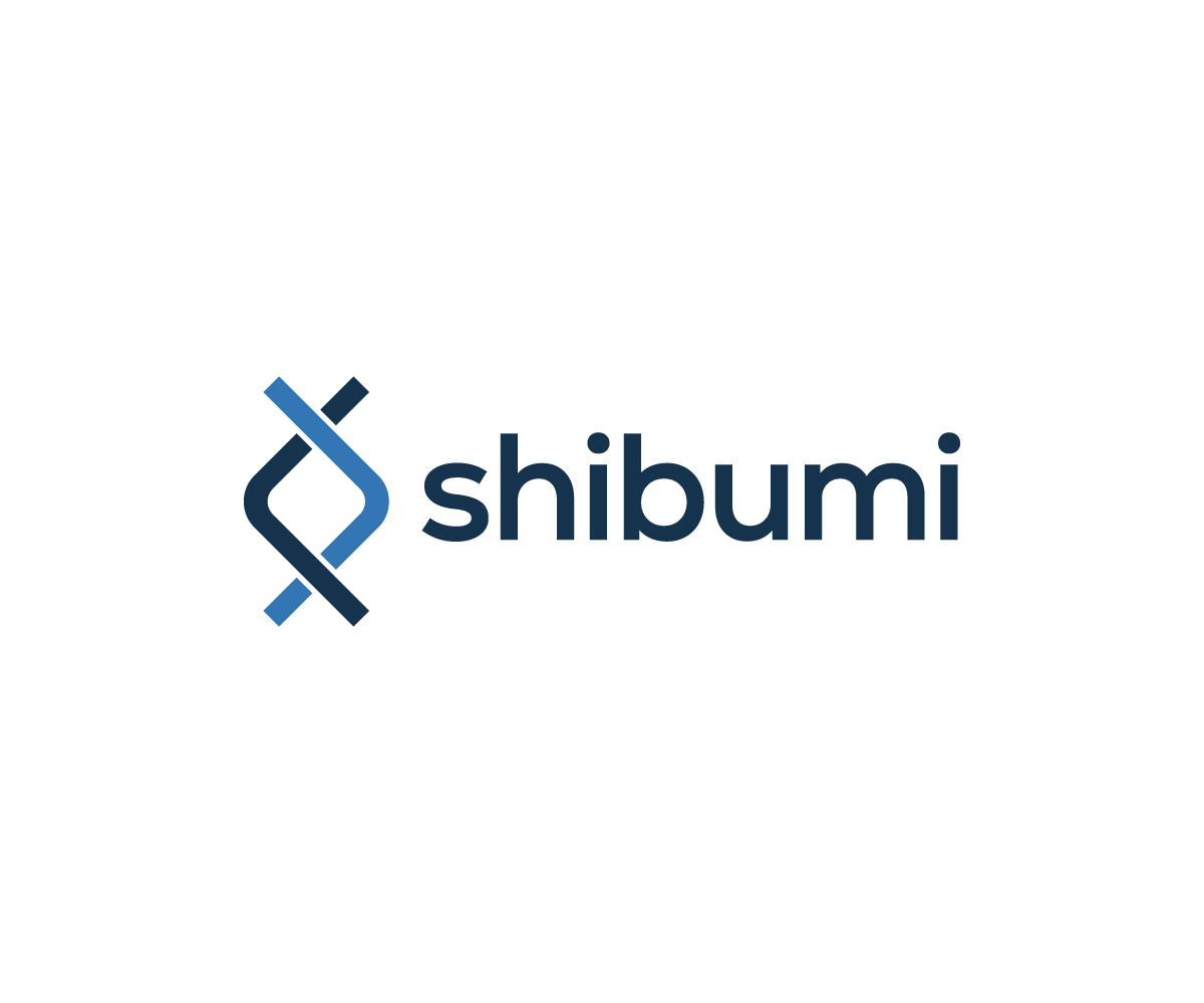
This customer received 66 logo designs from 38 designers. They chose this logo design from Thìnk as the winning design.
Join for free Find Design Jobs
-
 £110
-
 66 designs
-
 38 designers
Logo Design Brief
Shibumi is a consulting business - we offer many services to our business to business clients: market research, innovation, new product development and engineering. Sectors include food and drink, medical device, green tech, product engineering and optical instrumentation.
Shibumi is Japanese and means - 'effortless perfection' or ' simple, subtle, and unobtrusive beauty'.
The image we have chosen is a rune symbol: Inguz
"Inguz, a viking symbol meaning "where there is a will, there is a way". This Rune may mark a time of joyful deliverance, of new life, a new path. A Rune of great power, receiving it means that you now have the strength to achieve completion, resolution, from which comes a new beginning."
Target Market(s)
see above
Logo Text
shibumi
Logo styles of interest
Abstract Logo
Conceptual / symbolic (optional text)
Font styles to use

Colors
Colors selected by the customer to be used in the logo design:
Look and feel
Each slider illustrates characteristics of the customer's brand and the style your logo design should communicate.
