PlantSavers - Logo overhaul and sub-brands design
Want to win a job like this?
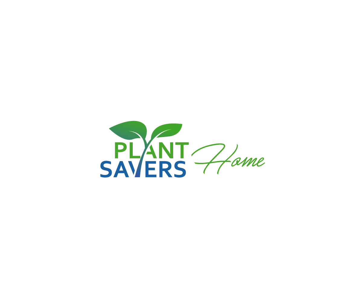
This customer received 143 logo designs from 35 designers. They chose this logo design from CastleArtFlag as the winning design.
Join for free Find Design Jobs-
 £80
£80
-
 143 designs
-
 35 designers
Logo Design Brief
PlantSavers is company I co-founded last year. We sell plants and gardening products online and deliver them to customer's homes. We already have a logo which includes a basic image featuring a hand and a pot plant + the word "PlantSavers". There are a few aspects we are aiming to change/improve/hear ideas:
1) "PlantSavers" the word (- we like this simple clean design/font but are open to new suggestions. Font is currently Metropolis which we like! We also want to remove the phrase below it "Growers.Plants.People". (Sub-brands below should be a different font).
2) the image hand and pot plant - we like the idea of a hand and a simple icon with a plant, but feel our existing icon just lacks something to make it impressive. We would like to see ideas on a complete redesign or new approach to an image/icon (featuring a hand and a plant, but open to new ideas...maybe featuring planet earth too)
3) SUB-BRANDS - this is really important. This year we are launching 3 new sub-brands: "PlantSavers Home" which is the brand we'll sell house plants from / "PlantSavers Garden" which is the brand we'll sell outdoor plants from / "PlantSavers Pantry" which is the brand we'll sell edible plants like fruits, vegetables and herbs from. There are also some other Sub-brands, but these are the main 3. We would like each of these sub-brands to have the word "PlantSavers" and the word of the sub-brand (eg PlantSavers Home, but maybe have the word Home in a different style/font/colour etc). THE FONT OF THE WORD IN THE SUB-BRAND (eg, "Home", "Garden", "Pantry") SHOULD BE DIFFERENT FONT TO "PlantSavers" (which is currently Metropolis).
We would also like each of the sub-brands to have an icon for it (a basic solid block image) - eg maybe "PlantSavers Home" has an icon of a cute house.
I have included the original logo file. I have some ideas on the sub-brands, but won't include these as I would love to see what cool and interesting designs you can come up with.
The file that says "Best Layout" is the way I like it best with the image on the LEFT and the "PlantSavers" text on the right.
Industry/Entity Type
Gardening
Logo Text
PlantSavers
Logo styles of interest
Pictorial/Combination Logo
A real-world object (optional text)
Look and feel
Each slider illustrates characteristics of the customer's brand and the style your logo design should communicate.
Elegant
Bold
Playful
Serious
Traditional
Modern
Personable
Professional
Feminine
Masculine
Colorful
Conservative
Economical
Upmarket
Requirements
Must have
- Cool new design of the PlantSavers image that features in our logo. Also the sub-brands are a crucial part of this project.