Restaurant needs a logo design**
Want to win a job like this?
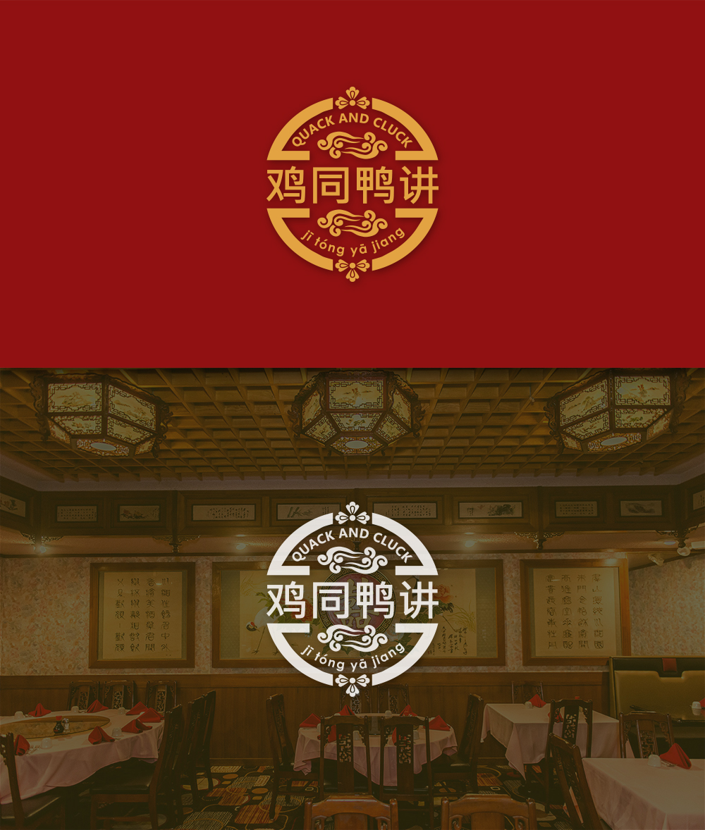
This customer received 38 logo designs from 14 designers. They chose this logo design from dk_Grafika as the winning design.
Join for free Find Design Jobs-
 US$150
-
 38 designs
-
 14 designers
Logo Design Brief
The restaurant (kopitiam oriented style) is located within old china town in Kuala Lumpur, Malaysia. The premise of the restaurant is a standalone china-house style 2 storey building, and the restaurant will be at the 1st floor.
The restaurant is intended to reflect a balance of western (british oriented) and chinese culture. The food served will mainly be chinese food with british influence. Decoration will involve vintage oriental approach (round table, wooden chair, chinese paintings on the wall).
Name of the restaurant: 鸡同鸭讲 (English name still being considered – happy for you to provide recommendation) (read: jī tóng yā jiang), color palette: red, yellow, a bit of light blue. Square designs.
鸡同鸭讲 jī tóng yā jiǎng means a chicken cannot make itself understood by a duck. This idiom is used to express disconnected communication between 2 people, which could be caused by language barrier, being drunk, coming from different cultures, etc.
Updates
Gathering more feedback
Target Market(s)
Local trendy millennials (mainly Malaysian - Chinese), expatriates, travelers.
Logo Text
鸡同鸭讲 (jī tóng yā jiǎng) (Quack and Cluck)
Look and feel
Each slider illustrates characteristics of the customer's brand and the style your logo design should communicate.
Elegant
Bold
Playful
Serious
Traditional
Modern
Personable
Professional
Feminine
Masculine
Colorful
Conservative
Economical
Upmarket
Requirements
Must have
- 鸡同鸭讲 (jī tóng yā jiǎng) (Quack and Cluck)
Must reflect both european and chinese style, not too heavy on the chinese side. Should not create impression that the restaurant is chicken and duck specialist restaurant.