fitness and lifestyle coaching business that needs a logo design
Want to win a job like this?
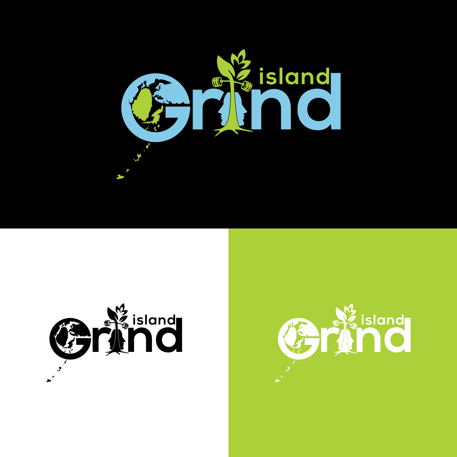
This customer received 48 logo designs from 15 designers. They chose this logo design from veni 6 as the winning design.
Join for free Find Design Jobs-
 C$130
C$130
-
 48 designs
-
 15 designers
Logo Design Brief
So the design is for my logo i already have my logo which is represented in the pictures below i want it to mainly remain the same like everything should stay like the colours and the design but i want a few changes made to it. They are:
The letter G in the word grind
So the first change I want to make is with the letter G of the word grind I love the current style of the G. But I want to make a change to it, so I want to make the Letter G itself to be a little wider and bigger so that I can draw things in the draw like the world map I want it to look earthy like these examples I want G to look like these in the photos below:
The second thing
The rock
The second thing I want to change is the shape of the rock, that the tree in island grind is growing out of I still want the tree growing out of it the same way. But what I want the shape of the rock to be in the shape of a man’s face with the split in it the same way and the tree growing out of it.
3rd Thing
The islands
The last thing that I wanted to change was the chain of islands that are coming out of the G. I really like them, the only thing is that I want is them to represent my actually chain of islands where I’m from so I’ll send you a pic of my actually island chin and we can those the new chain of island. This how my actually chain of island look in photos below
Industry/Entity Type
Fitness
Logo Text
island grind
Logo styles of interest
Wordmark Logo
Word or name based logo (text only)
Font styles to use
Look and feel
Each slider illustrates characteristics of the customer's brand and the style your logo design should communicate.
Elegant
Bold
Playful
Serious
Traditional
Modern
Personable
Professional
Feminine
Masculine
Colorful
Conservative
Economical
Upmarket
Requirements
Must have
- Its must look like the orginal logo i want everything the same in the logi j ust the changes that i asked for
Nice to have
- The letter G
So the first change I want to make is with the letter G of the word grind I love the current style of the G. But I want to make a change to it, so I want to make the Letter G itself to be a little wider and bigger so that I can draw things in the draw like the world map I want it to look earthy like these examples I want G to look like these in the photos below:
The second thing
The rock
The second thing I want to change is the shape of the rock, that the tree in island grind is growing out of I still want the tree growing out of it the same way. But what I want the shape of the rock to be in the shape of a man’s face with the split in it the same way and the tree growing out of it.
3rd Thing
The islands
The last thing that I wanted to change was the chain of islands that are coming out of the G. I really like them, the only thing is that I want is them to represent my actually chain of islands where I’m from so I’ll send you a pic of my actually island chin and we can those the new chain of island. This how my actually chain of island look in photos