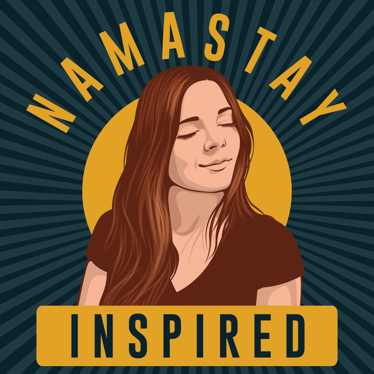
Namastay Inspired Podcast Cover Art
Want to win a job like this?
This customer received 81 graphic designs from 17 designers. They chose this graphic design from singhania as the winning design.
Join for free Find Design Jobs-
 US$190
-
 81 designs
-
 17 designers
Graphic Design Brief
We need cover art design for our podcast that we'll be starting. The podcast will be long form interview format. The podcast will cover a wide range of topic discussions with people who have inspirational stories. The name of the podcast is Namastay Inspired. I, Ashley Adams, want to be the "face" of the cover art.
I want this cover art to find inspiration from the attached image titled "the inspiration". I like the image of the girl and how she appears in bliss with the flow of her hair. This little bread company sticker is the main inspiration for what I want. I want the font to be similar to the "brandlogo" but if you feel it should be different then I am open minded to it. I also attached an image of me looking toward the sun because that's what I want the girl to be doing in the cover art. I also attached a more recent picture of "me" to give you an idea of me today and my hair.
I do not think I am a fan of the black background in the little bread company sticker, and I'm not sure I want to keep the red in the logo. I think I want to pivot and you more earthy tones. I am open to vibrant earthy colors as well as more dull.
Target Market(s)
My organization seeks to raise the conscious awareness so that we may all reach a higher vibration on earth. My target audience are people who are longing for inspiration, they're open minded individuals and are looking to learn. They might be predominately female.
Font styles to use
Other font styles liked:
- The fonts used in the attached image are moontime and London.
Look and feel
Each slider illustrates characteristics of the customer's brand and the style your logo design should communicate.
Elegant
Bold
Playful
Serious
Traditional
Modern
Personable
Professional
Feminine
Masculine
Colorful
Conservative
Economical
Upmarket
Requirements
Nice to have
- I'm not sure I want to keep the red in the logo. I think I want to pivot and you more earthy tones. I am open to vibrant earthy colors as well as more dull.
Should not have
- Do not directly copy anything from the "little bread company" sticker. This is not acceptable work. The design must be 100% original and only inspired based on the images I provided.