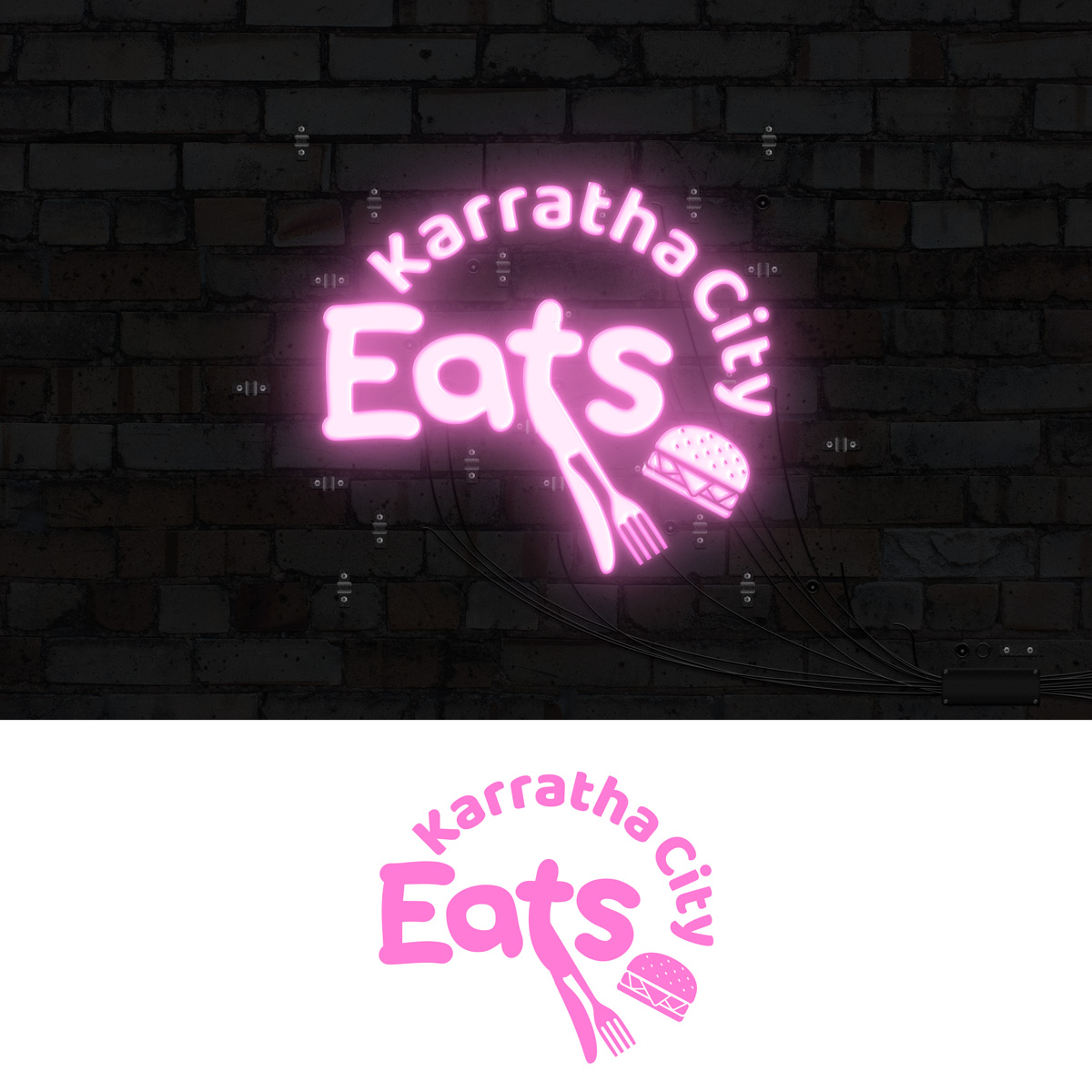
Karratha City Eats - monthly food markets
Want to win a job like this?
This customer received 159 logo designs from 83 designers. They chose this logo design from DesignConnection Impressive Sol as the winning design.
Join for free Find Design Jobs- Guaranteed
-
 A$120
A$120
-
 159 designs
-
 83 designers
Logo Design Brief
We need a funky, fresh new logo for our new monthly food markets. We would like to see designs that are fun! We’d prefer if ‘Karratha City’ was in 1 font and then ‘eats’ was another. The eats font should be LOUD and bold. That is the main focus.
The ‘eats’ could be 5-6 times bigger than the ‘Karratha City’ wording. Real focus on that. The word ‘eats’ could also be all different colours, but keep ‘Karratha City’ one font style and colour
Something that would really stand out when people are scrolling on social media.
Target Market(s)
Young people and families
Logo Text
Karratha City Eats
Logo styles of interest
Abstract Logo
Conceptual / symbolic (optional text)
Wordmark Logo
Word or name based logo (text only)
Lettermark Logo
Acronym or letter based logo (text only)
Colors
Designer to choose colors to be used in the design.
Look and feel
Each slider illustrates characteristics of the customer's brand and the style your logo design should communicate.