Amazing fitness instructor looking for an equally amazing designer
Want to win a job like this?
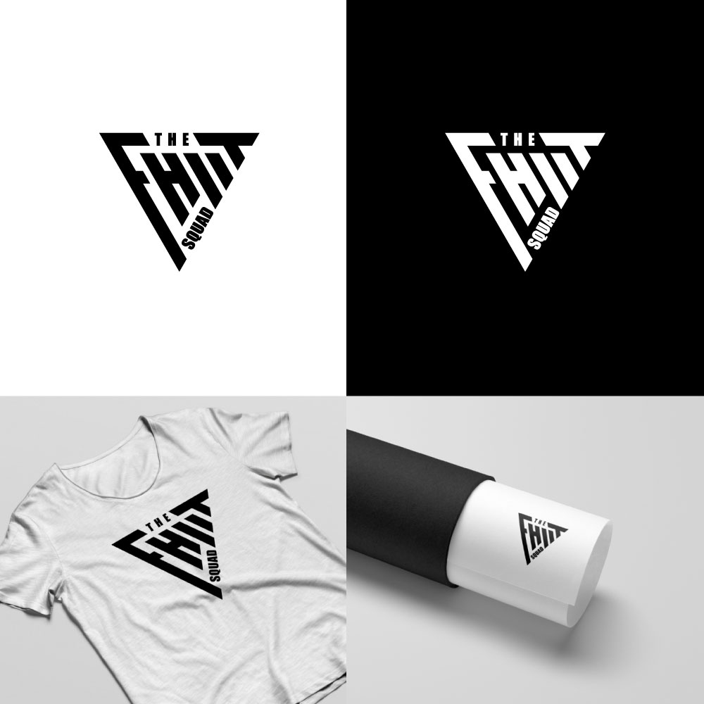
This customer received 208 logo designs from 118 designers. They chose this logo design from revenue.design as the winning design.
Join for free Find Design Jobs- Guaranteed
-
 £110
£110
-
 208 designs
-
 118 designers
Logo Design Brief
The FHIIT Squad is High Intensity Interval Training to get people fit quickly.
I want to help children to understand that exercise can be fun and really effective if you do the right things.
I also want obese adults to feel safe to re-engage with exercise, supported and welcomed.
Thanks for looking, and thanks for offering your design suggestions - you're all amazing :)
Updates
Need extra days to review
Target Market(s)
I'm starting with children/young adults 8-18yrs and adults dealing with obesity.
Industry/Entity Type
Fitness
Logo Text
The FHIIT Squad
Logo styles of interest
Emblem Logo
Logo enclosed in a shape
Abstract Logo
Conceptual / symbolic (optional text)
Font styles to use
Colors
Colors selected by the customer to be used in the logo design:
Look and feel
Each slider illustrates characteristics of the customer's brand and the style your logo design should communicate.
Elegant
Bold
Playful
Serious
Traditional
Modern
Personable
Professional
Feminine
Masculine
Colorful
Conservative
Economical
Upmarket
Requirements
Must have
- Graphic not photos
- Graphic that will work on different colour T-shirts as well as digital media
- Colours and style should be gender neutral and feel accessible
- LOGO TEXT EXPLAINED:
- - Text is 'The FHIIT Squad'
- - 'The' can be lower or upper case, or removed from the logo completely
- - 'FHIIT' is a play on words, merging Fit and HIIT into one word
- - 'F' in FHIIT can be either lower or upper case. F is short for 'Fit'
- - 'HIIT' needs to be in capitals as this is an acronym for High Intensity Interval Training i.e. pushing yourself hard to get the maximum out of a short exercise session.
- - 'Squad' can be lower, upper or initial caps - whatever you recommend.
Nice to have
- Logo and text - if the font becomes the hero, then that's ideal, but a swoosh or simple graphic as well would be welcomed too
- Choices of colours would help, but like yellow/grey (image example included)
Should not have
- No use of people or fitness equipment in the logo design
- Do not use a body builder or overtly masculine or elite imagery