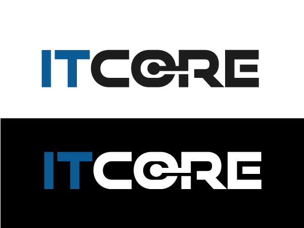
IT Company - Needs A Logo Design

Want to win a job like this?
This customer received 194 logo designs from 73 designers. They chose this logo design from Alien Cookie as the winning design.
Join for free Find Design JobsLogo Design Brief
I’d like a logo for ITCORE.
We’re an IT company. You can see what we do at http://goo.gl/bhvyw3
We are working on a new site (still work in progress); you can see new services listed there: http://goo.gl/kSLmDK
The new site is a new look, as you can see…
…so it’ll be a happy coincidence if the logo works well in the look / feel of that new site.
But I don’t want you to start with that as a direction.
That’s a strong ‘But’:
I’m thinking a logo should be a distillation of our visual identity, and the other stuff – site / marketing materials – should grow from there. So let’s start with a blank sheet of paper / screen, and with ideas.
Here are some first thoughts:
– I think the word ‘core’ has a very solid feel that works great for an IT company that runs rock-solid systems. So I think the logo should have a solid feel.
– ‘Core’, to me, suggests a circle, and we have a circle in the ‘O’ of the word core. I’m wondering how we might be able to use that, but then again if you have other ideas I am totally open.
– ITCORE really is two words: IT Core. That'll need to be clear. (But I am not suggesting that the words necessary need to be separated, perhaps color / font can help do this, I will let you decide.
– The feel of the logo needs to work for ‘IT’.
– I want something simple, and of course: effective and unique to us.
– I kind of like the idea of a typographic solution. I.e. not an icon sitting next to the word ITCORE; rather, a twiddle of something within the word ITCORE to make it ‘us’. (Though I’m completely open to considering an icon solution if it makes sense)
– I like the idea of ONE simple twiddle. I.e. that the type (font) is considered, kerned, and preened so it looks great and visually ‘says’ the right things for us as a company. And that in addition to this, there is one thing changed within the word: for example, one twiddle to one of the letters, or to something within the lettering. The ‘O’ I mentioned, might be this. I think this one-twiddle thing (I keep saying the word ‘twiddle’ – sorry…) …anyway: I think that one-twiddle thing can make for a strong one-focus Bam ‘here we are’ solution. (Rather than having a bunch of dancing gnomes as a logo.)
– My target market knows what ‘IT’ is: Information Technology. I think everyone knows that really. And all my marketing material will of course have ‘IT’ context. So I don’t really think there’s an issue in the ‘IT’ being mistaken for ‘it’ as in ‘it is’. But I’m mentioning this just in case you have any thoughts about this. I’m looking for a simple, effective solution, and I think using periods / full-stops (I.T. Core) probably isn’t necessary, and might take from the simplicity. That’s my thought. I’m open to your thoughts.
In terms of the background, I want the logo to look great on the following backgrounds, even though we might only use black on the web site.
1. Black
2. White
3. Dark Blue / Navy
The logo should also look great just in black on a white screen. Not because I intend to use it like that and nor because I send a ton of faxes; but because I think black-and-white indicates the shape is strong. (Just some personal thoughts)
– None of these things are definite directions. If you have a different idea, I’m happy to hear it / look at it.
– Any questions, just ask. I’m open to looking at things at an early stage if you wish to present a thought, or run an idea by me.
Thanks
George.
Updates
Hello Designers
I just wanted to thank you all for your contribution to thelogo design contest.
We had a lot of interesting logos to choose from for theproject which always makes the decision difficult.
Thank you again for all your efforts and we hope to workwith you in the future.
George.
Added Friday, January 24, 2014
Target Market(s)
Potential business customers interested in quality IT solutions and Services.
Industry/Entity Type
It Company
Logo Text
ITCORE
Logo styles of interest
Pictorial/Combination Logo
A real-world object (optional text)
Abstract Logo
Conceptual / symbolic (optional text)
Wordmark Logo
Word or name based logo (text only)
Lettermark Logo
Acronym or letter based logo (text only)