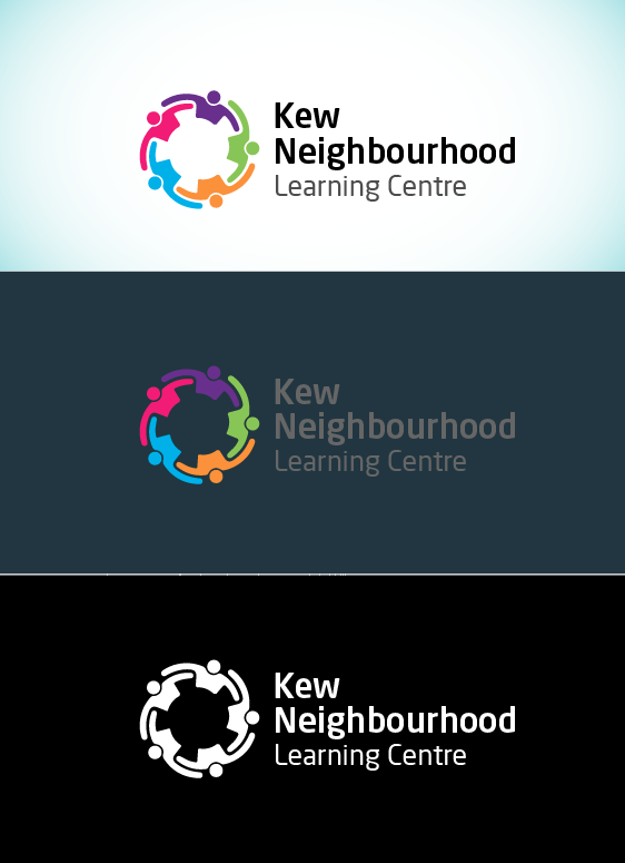
Logo for community centre redesigned keeping similar colours and concept
Want to win a job like this?
This customer received 86 logo designs from 41 designers. They chose this logo design from Design Republic as the winning design.
Join for free Find Design Jobs-
 A$150
A$150
-
 86 designs
-
 41 designers
Logo Design Brief
We'd like our logo to be redone to be more modern and professional. We still want to keep similar range colours and concept of the people holding hands in a circle. There is also a very similar logo that was inspired by our current logo that we can't look too similar too.So, please adapt the logo with 'Kew Neighbourhood Learning Centre' on it, to look more modern and professional, using similar colours and concept.Second, please make sure your logo doesn't look (even more) similar to the 'Neighbourhood Houses Boorondara' logo, which is attached for your reference. This logo was clearly 'inspired' from our logo, so do your best to ensure distinct branding even though we actually want something similar to the Boroondara logo!Thanks, and we will try and answer questions promptly.
Updates
Hi everyone,
Thank you for all your designs. There is some fantastic work being submitted.
I have now begun consulting with the relevant stakeholders on the most appropriate submission for our needs. We will be providing feedback during this process.
Many thanks,
Owen
Added Friday, August 16, 2019
Target Market(s)
Community sector, e.g. older people, people with disabilities, newly arrived migrants, unemployed, parents.
Industry/Entity Type
Community Center
Logo Text
Kew Neighbourhood Learning Centre
Font styles to use
Look and feel
Each slider illustrates characteristics of the customer's brand and the style your logo design should communicate.
Elegant
Bold
Playful
Serious
Traditional
Modern
Personable
Professional
Feminine
Masculine
Colorful
Conservative
Economical
Upmarket
Requirements
Must have
- Representation of community adapted from existing logo
Nice to have
- Combining a more professional look while still communicating approachability