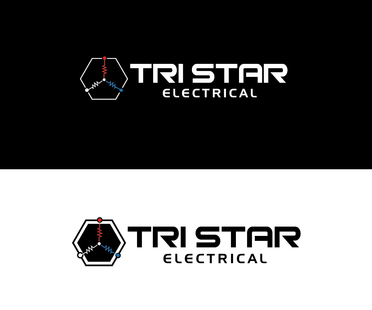
Electrifying Electricians - Tri Star Electrical

Want to win a job like this?
This customer received 62 logo designs from 39 designers. They chose this logo design from renderman as the winning design.
Join for free Find Design JobsLogo Design Brief
Company name derived from Speight's beer in New Zealand and intended to look professional as well as a bit cheeky. Design needs to reflect this, however not infringe on trademarks and copyrights.
Possible design ideas could include the use of 3-phase electricity and the star or wye method of winding electrical equipment as well as the use of red, white and blue which are the colours for electrical conductors in New Zealand.
The business is an electrical design and inspection company.
Target Market(s)
Industrial, manufacturing and automation companies.
Logo Text
Tri Star Electrical
Logo styles of interest
Pictorial/Combination Logo
A real-world object (optional text)
Abstract Logo
Conceptual / symbolic (optional text)
Font styles to use
Colors
Colors selected by the customer to be used in the logo design:
Look and feel
Each slider illustrates characteristics of the customer's brand and the style your logo design should communicate.
Elegant
Bold
Playful
Serious
Traditional
Modern
Personable
Professional
Feminine
Masculine
Colorful
Conservative
Economical
Upmarket
Requirements
Nice to have
- Relation to "star" windings found in electrical equipment and the use of red, white and blue for each of these windings.