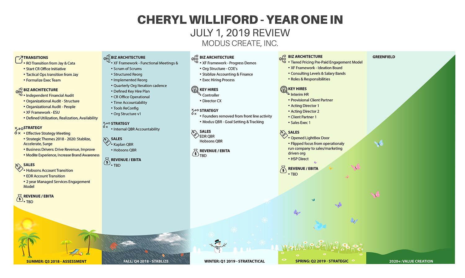
Executive Performance Review mapped on J-curve
Winner
Want to win a job like this?
This customer received 33 infographic designs from 12 designers. They chose this infographic design from IndreDesign as the winning design.
Join for free Find Design Jobs- Guaranteed
-
 US$190
-
 33 designs
-
 12 designers
Infographic Design Brief
I need to turn an executive company performance review into a visual infographic. The list of accomplishments is grouped into four calendar quarters. Each quarter needs a subtle representation of the season. The four quarters and associated list of accomplishments need to be mapped to a J-curve. - Spreadsheet with accomplishments attached (Throughput)- Sample image of a J-curve. You can google J-curve to see more images.- The title should be "Cheryl Williford Year in Review"
Target Market(s)
Board of Directors
Look and feel
Each slider illustrates characteristics of the customer's brand and the style your logo design should communicate.
Elegant
Bold
Playful
Serious
Traditional
Modern
Personable
Professional
Feminine
Masculine
Colorful
Conservative
Economical
Upmarket
Requirements
Nice to have
- This will be presented to a company founder that is an artist and customer experience expert. He is very visual so a nice visual representation of the data will be impactful. He also uses the phrase that you have to live with or work with someone for four seasons before you really know them. This is why I have the seasons mapped to the quarters. The Fall season motif should be gloomy and stormy.
Files
Download all files - 0.0 MBPNG
j_curve.png
Thursday, May 23, 2019
XLSX
Cheryl Year in Review v2 Saturday, 25 May 2019 15:26:49
Saturday, May 25, 2019
Payments
1st place
US$150
Participation payments x 4
US$10