Value-added components of an energy-as-a-service provider
Want to win a job like this?
This customer received 17 graphic designs from 7 designers. They chose this graphic design from Rickyy as the winning design.
Join for free Find Design Jobs-
 US$110
-
 17 designs
-
 7 designers
Graphic Design Brief
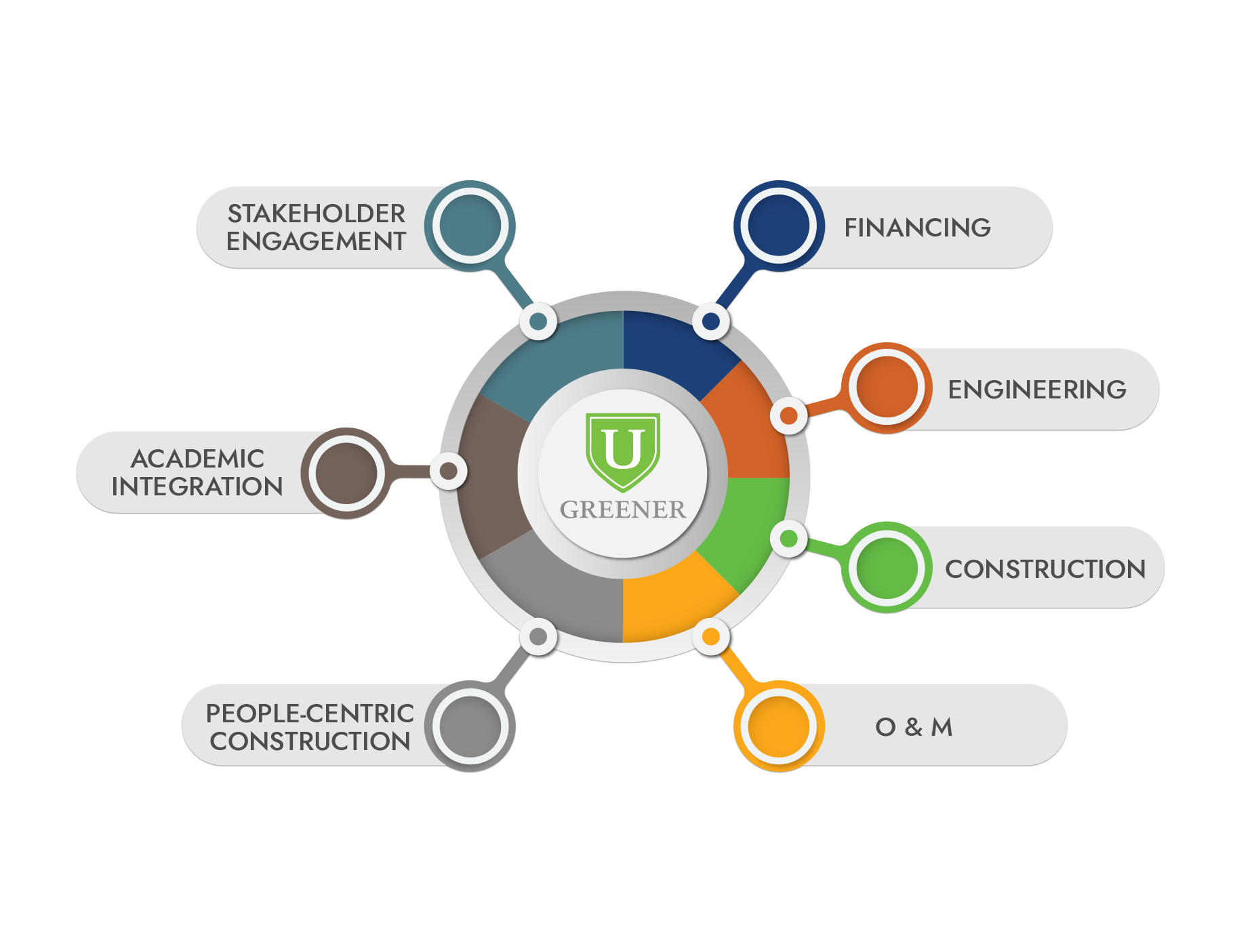
GreenerU (www.greeneru.com) is a turnkey energy solutions provider for educational institutions—which essentially means we can make recommendations for ways to improve heating, cooling, ventilation, lighting, building controls, etc., and then turn around and project-manage the implementation of these recommendations.Part of what makes us different than our competitors is recognizing the unique way that educational institutions make decisions: they employ a more collaborative approach, and given the 24/7 nature of school operations, any construction needs to be very carefully planned and communicated with building occupants.We are looking at competing in the "energy-as-a-service" (EaaS) field, which effectively capitalizes on the way institutions can self-supply energy. The biggest hurdles for most projects that either produce or conserve energy are (1) upfront cost (these projects are really expensive) and (2) implementation (full-time employees on campuses already have too much on their plates). What EaaS providers can do is alleviate these burdens by finding the capital to pay for equipment, which the school then repays through the associated energy savings. Providers also do the work of implementing the changes.GreenerU offers the same basic characteristics that other EaaS providers offer—but we have a few elements that are like the icing on the cake, or the cherry on top (insert your own dessert metaphor here). Namely, we work exclusively with schools and are familiar with that environment, know how to work around sensitive scheduling constraints, know how to engage stakeholders in an academic environment, etc. That's what we would like help with in a graphic. There's a couple of renderings we did in-house, but the feedback on the less crude one attached is that there's a bit too much emphasis on the three differentiating elements, and that it could be a bit more visually appealing. We're really open to suggestions here, but keeping it simple and classy is still paramount. Attached is the GreenerU brand standards guidebook, which has our color palette and fonts and such, and a couple of iterations of our logo are also attached.
Look and feel
Each slider illustrates characteristics of the customer's brand and the style your logo design should communicate.