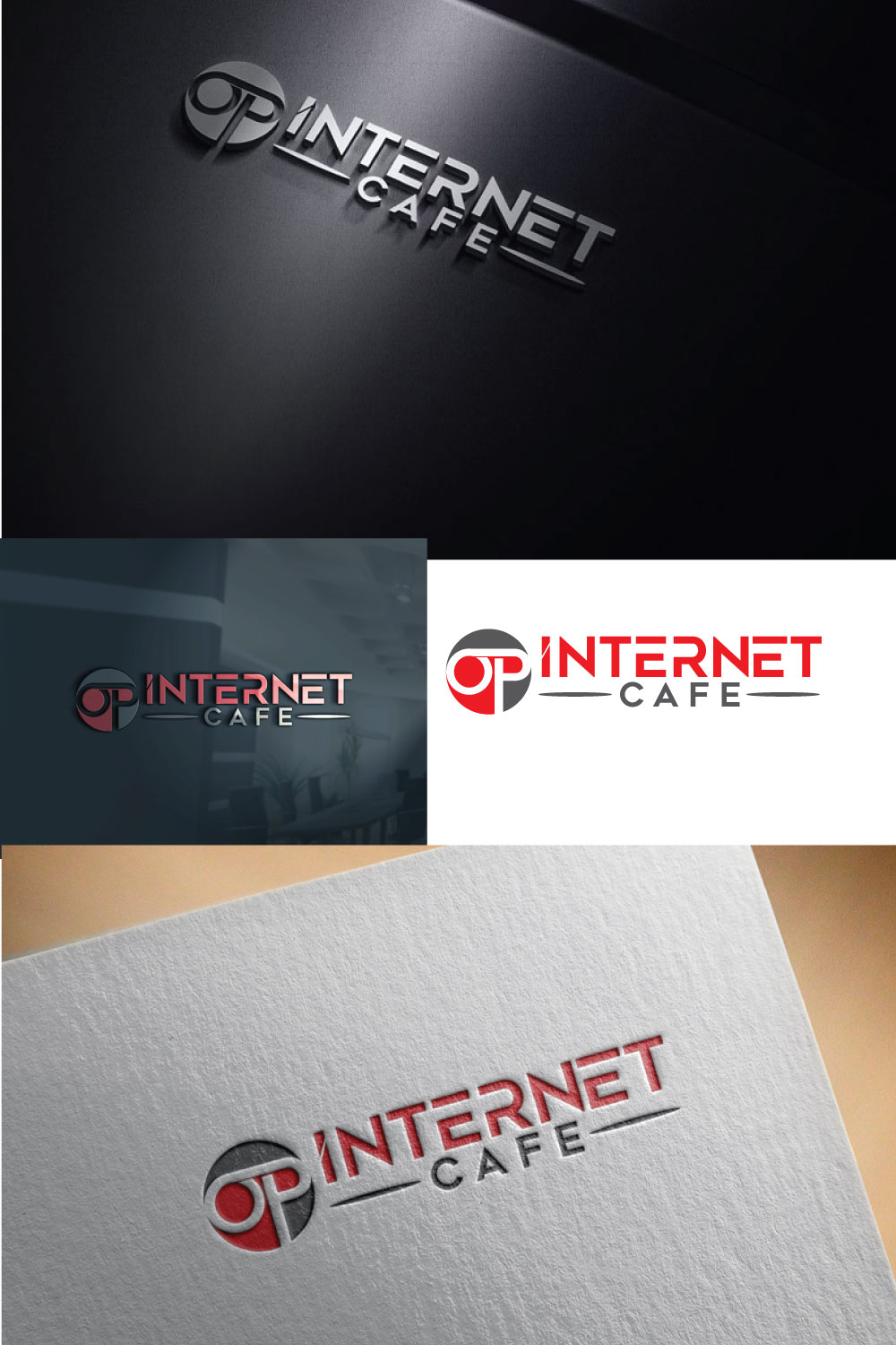
OP Internet Cafe
Winner
Want to win a job like this?
This customer received 60 logo designs from 39 designers. They chose this logo design from alhamdulilla as the winning design.
Join for free Find Design Jobs- Guaranteed
-
 US$110
-
 60 designs
-
 39 designers
Logo Design Brief
Our business is internet cafe(pc gaming center) with 50+ high end gaming pcs. We provide full kitchen menu from simple finger food to bubble teas and smoothies. OP stands for overpowered which is popular gaming term when the character or the player is too good or too strong. I was thinking O would look like bullseye or crosshair and P would look like a cast iron pan which is iconic item in the game PUBG.
Target Market(s)
Teenagers/college students to avid gamers
Logo Text
OP Internet Cafe
Colors
Designer to choose colors to be used in the design.
Look and feel
Each slider illustrates characteristics of the customer's brand and the style your logo design should communicate.
Elegant
Bold
Playful
Serious
Traditional
Modern
Personable
Professional
Feminine
Masculine
Colorful
Conservative
Economical
Upmarket
Requirements
Nice to have
- Separate logo with just "OP"
Files
Download all files - 9.2 MBJPEG
9765CF43-1381-48D4-A2B9-E4432E6A8BB9.jpeg
Monday, May 6, 2019
JPEG
101ADA32-CF2B-4AAA-A54A-C3854D2ACCCF.jpeg
Monday, May 6, 2019
JPEG
4F65835A-7173-48F6-8E41-EFE04A674514 Monday, 06 May 2019 16:38:55
Monday, May 6, 2019
JPEG
176E9B18-A9F7-4C11-AA7A-36921D07D240 Monday, 06 May 2019 16:38:56
Monday, May 6, 2019
Payments
1st place
US$110