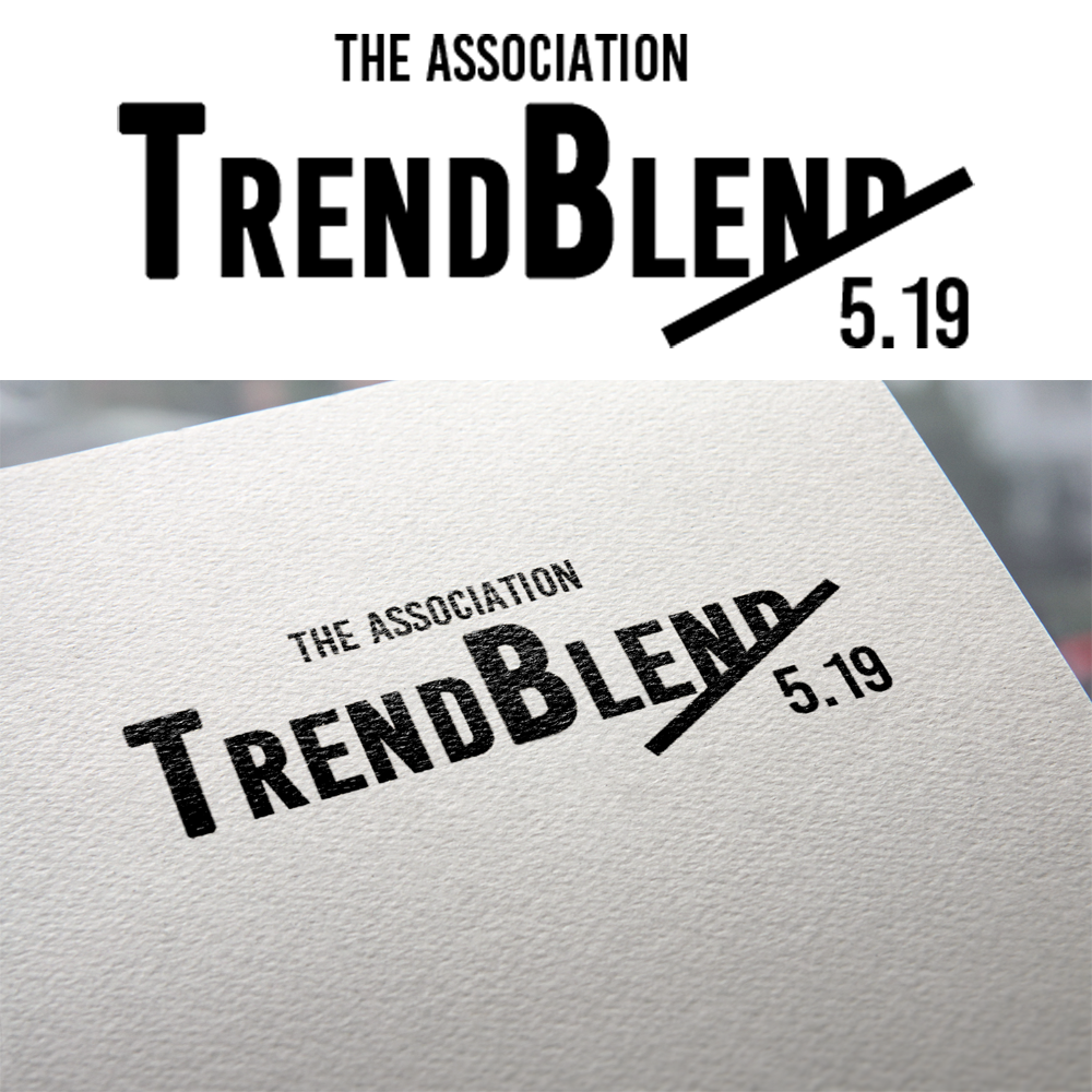
Logo for an event produced by 5 association-focused partners
Want to win a job like this?
This customer received 77 logo designs from 39 designers. They chose this logo design from Kyuuma as the winning design.
Join for free Find Design Jobs-
 US$150
-
 77 designs
-
 39 designers
Logo Design Brief
We need to create a clean, modern feeling logo for a series of events that five groups will be co-producing. The event will be focused on delivering insights on hot topics within the association world, followed by dinner/drinks. The identity should feel warm and welcoming, but not silly. It's professional, but not stuffy. A tech feel is totally appropriate. The name of the event is "The Association TrendBlend" Please refer to the attached PDF for direction on how we envision the organization of copy. NOTE: please don't just copy the look of the sample attached—this was done just to sell the name.
Please also set type for the tagline and consider how you would lock it up with the logo.
We see this as primarily a type-driven identity, but don't be afraid to explore a logo mark if you wish. Just avoid cliches like lightbulbs, swooshes and people figures.
Colorwise, we're open ... as long as it meets the criteria outlined above for the feel of the logo.
Typography ... if you're going to explore a serif font, it better feel modern.
.
Target Market(s)
Our audience consists of executives within associations and professional societies—non-profit, mission-driven organizations. Male and female, anywhere from 30 years old to 60s
Logo Text
The Association TrendBlend
Logo styles of interest
Pictorial/Combination Logo
A real-world object (optional text)
Wordmark Logo
Word or name based logo (text only)
Font styles to use
Colors
Designer to choose colors to be used in the design.
Look and feel
Each slider illustrates characteristics of the customer's brand and the style your logo design should communicate.
Elegant
Bold
Playful
Serious
Traditional
Modern
Personable
Professional
Feminine
Masculine
Colorful
Conservative
Economical
Upmarket
Requirements
Must have
- In terms of hierarchy, "TrendBlend"is the focus. The Association" should be minimized. The month/date component should be smaller too, and will change every time we schedule a new event.
- Please also set type for the tagline and consider how you would lock it up with the logo.
Nice to have
- We're open ... as we said, consider a mark if you feel it's appropriate.
Should not have
- NOTE: please don't just copy the look of the sample attached—this was done just to sell the name.