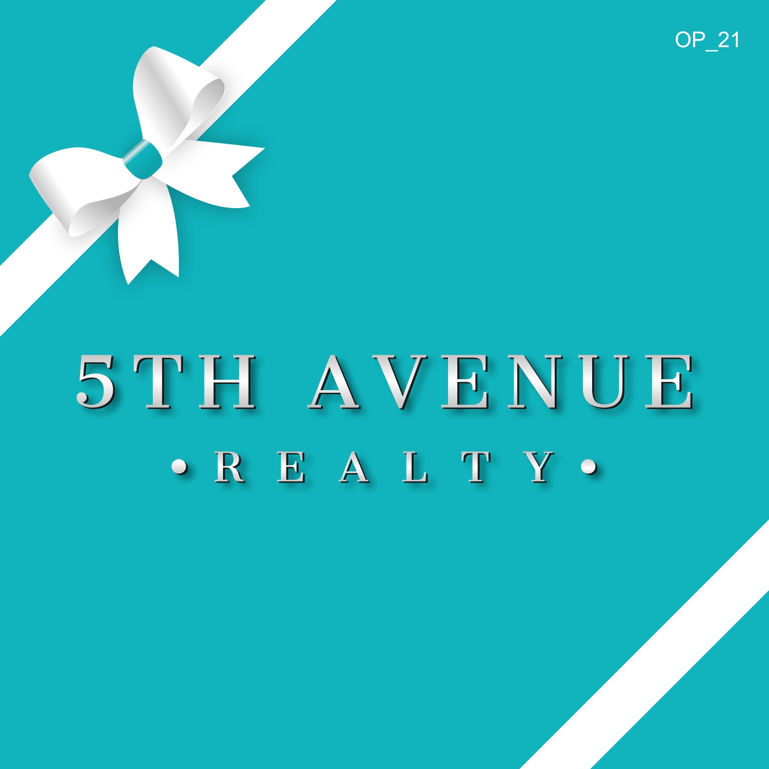
Logo design for a Residential Luxury Real Estate Brokerage
Want to win a job like this?
This customer received 244 logo designs from 109 designers. They chose this logo design from GVisions as the winning design.
Join for free Find Design Jobs-
 US$150
-
 244 designs
-
 109 designers
Logo Design Brief
Logo design for a Residential Luxury Real Estate Brokerage in Michigan. The logo should look elegant but clearly legible when driving by a for sale sign on a home. We prefer the logo to be the actual name of the company instead of a symbol of something... We like silver shiny, luminous font and maybe for the for sale signs a color close to "tiffany blue" for background color but lighter and with a less green tint. It may be nice to see a small bow like the ones attached in either that pearl color and Rose Gold Font or a white bow with the blue background.
Target Market(s)
Luxury Residential Buyers and Sellers
Industry/Entity Type
Real Estate Agent
Logo Text
5th Avenue Realty
Logo styles of interest
Wordmark Logo
Word or name based logo (text only)
Colors
Colors selected by the customer to be used in the logo design:
Look and feel
Each slider illustrates characteristics of the customer's brand and the style your logo design should communicate.
Elegant
Bold
Playful
Serious
Traditional
Modern
Personable
Professional
Feminine
Masculine
Colorful
Conservative
Economical
Upmarket
Requirements
Must have
- Must look very elegant but legible. Do not like the "5" to be too large. Prefer not to have the "5" on top of the rest of the company name.
- Must look like a very professional and luxurious company.
Nice to have
- Either Light blue tiffany blue-like color (nothing green) or a shimmering Pearl background with Rose Gold or Black font.
- I like the black on black bow but that should be the only time there is a black background since I don't really like a black background. Bu tit might look elegant to pair that black bow with a black background and rose gold or bright glimmering silver font and a splash of light blue.
- The A in Avenue and/or R in Realty might look nice if it was a fancier style then the rest of the font.
Should not have
- Too much Script int he font. The first letter is fine but not the entire logo in script.