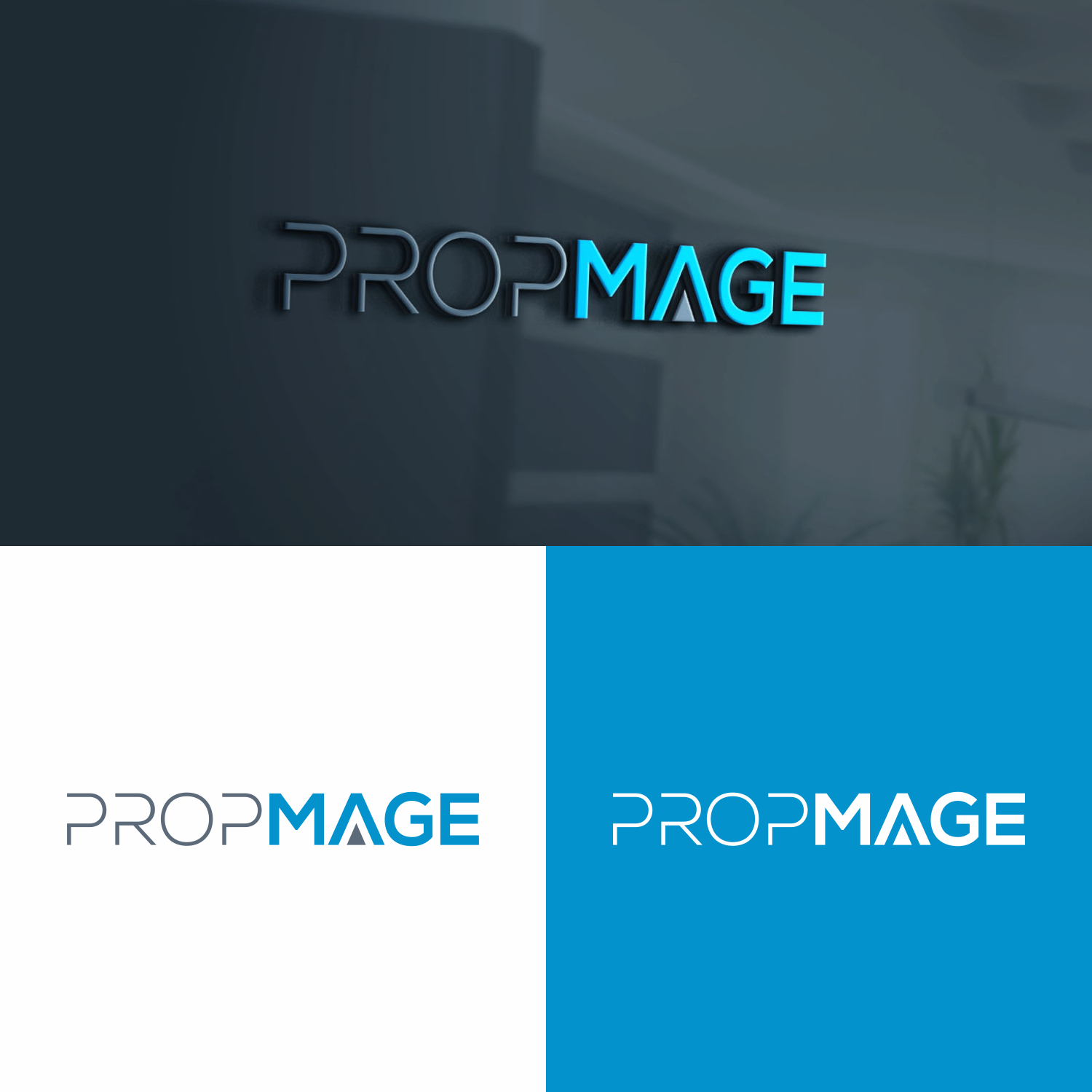
Property+Magic. Logo for PropMage - real estate CRM.
Want to win a job like this?
This customer received 84 logo designs from 38 designers. They chose this logo design from tejo as the winning design.
Join for free Find Design Jobs-
 US$150
-
 84 designs
-
 38 designers
Logo Design Brief
PropMage = Property+Mage.
Product - real estate CRM. It is a business management system for
- client management
- property management
- workflow management
- marketing.
Our system is very flexible, customisable and, as Dirk Gently would say, everything is connected. This allows our users to have a circumstantial view to their sales process. Ant that's the magic that we want to bring to their real estate bussiness.
Main colors - blue and white (see the screenshot of product attached). Blue can be different if you feel it's better for logo or it can stay the same.
Expectations for logo:
Our logo should communicate that we are trustworthy and innovative as is our product. BUT our tone of voice is simple, friendly and with sense of humor. So if you can somehow combine these two in an attractive way, we'd be happy.
Target Market(s)
Target audience - real estate agents, real estate developers, commercial property managers all around the world.
Industry/Entity Type
SaaS
Logo Text
PropMage
Logo styles of interest
Pictorial/Combination Logo
A real-world object (optional text)
Wordmark Logo
Word or name based logo (text only)
Colors
Colors selected by the customer to be used in the logo design:
Look and feel
Each slider illustrates characteristics of the customer's brand and the style your logo design should communicate.
Elegant
Bold
Playful
Serious
Traditional
Modern
Personable
Professional
Feminine
Masculine
Colorful
Conservative
Economical
Upmarket
Requirements
Must have
- It is very important that the "real estate"/"property" part would be easy to recognise in a logo.
Should not have
- We have a sense of humor, but we don't want to look like clouns.