Chocolate Bar*
Want to win a job like this?
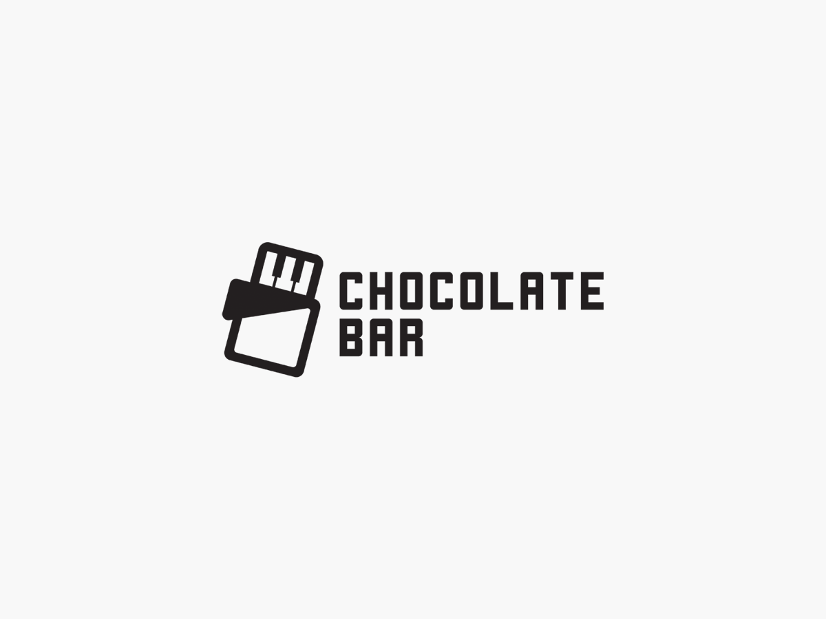
This customer received 46 logo designs from 26 designers. They chose this logo design from FRESTI as the winning design.
Join for free Find Design Jobs-
 US$110
-
 46 designs
-
 26 designers
Logo Design Brief
Chocolate Bar is an entertainment, record label and apparel brand/company. We specialise in music and music related events as well as design and retail of street wear. Personally love the flat look logo designs that play o the brand names. Whilst we already have a play on the name here, we envisage a chocolate bar/s that are shaped/look like a piano keys .But we are definitely open to other interpretations as we feel the name itself lends to some creative thinking.Key things are a logo that will be modern, fresh(we know cliche), and work on everything pretty much. We do not yet have corporate colours, but please, stay away from the obvious chocolate colours. Black is most ideal really.We want cool slightly hipster, but we take ourselves very serious.Hope this helps
Logo Text
Chocolate Bar
Look and feel
Each slider illustrates characteristics of the customer's brand and the style your logo design should communicate.