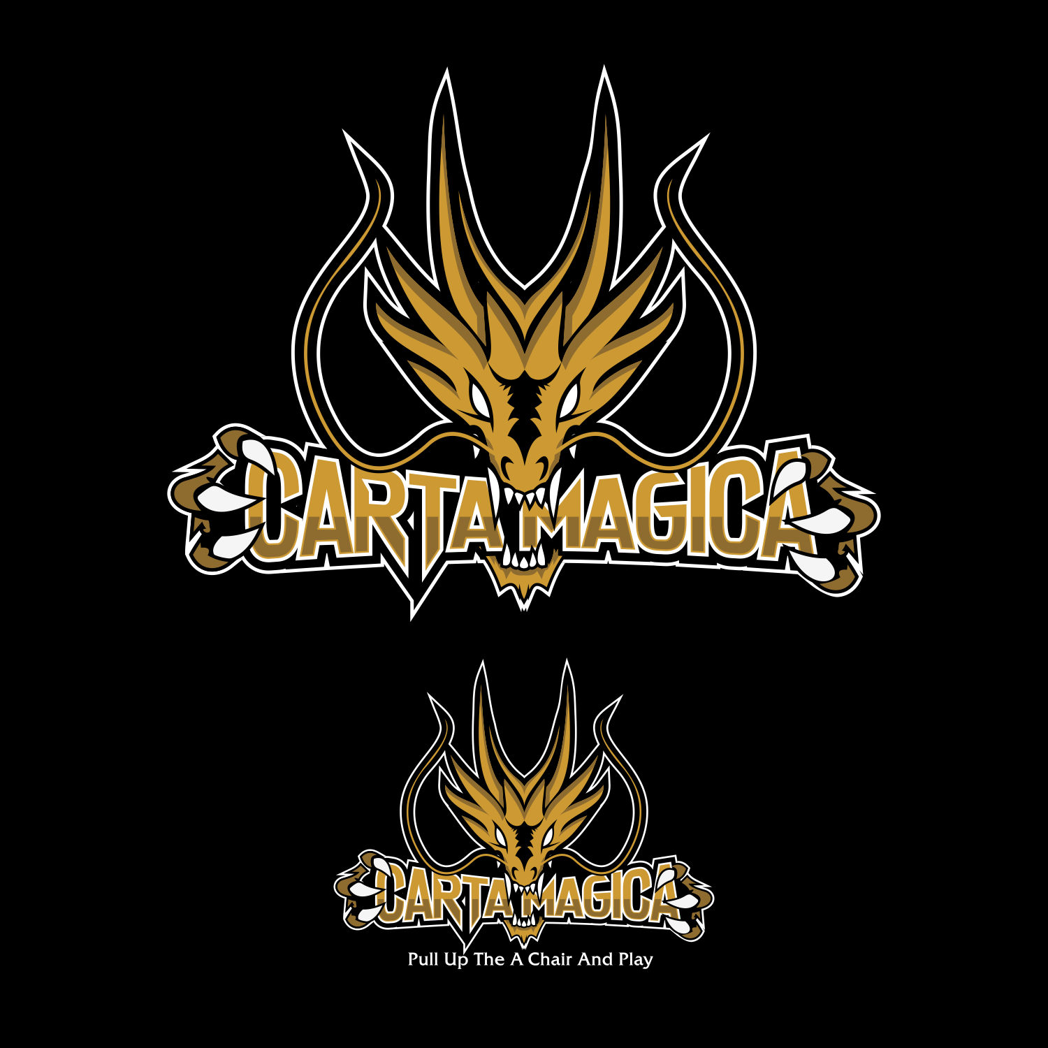
Carta Magica Front Facing Logo
Want to win a job like this?
This customer received 67 logo designs from 33 designers. They chose this logo design from toltole 2 as the winning design.
Join for free Find Design Jobs-
 C$150
C$150
-
 67 designs
-
 33 designers
Logo Design Brief
We are a gaming & Comic book shop. We are based out of Montreal and proud of it. We want the logo to stand out and be bold like our beloved City!
We like the idea of the current dragon front facing instead of a side view.
Show us your creative mind and have fun.
PLEASE MAKE SURE TO USE THE AI FILE ASA REFERENCE TO WORK FROM AT A STARTER
Updates
Low design quality
Target Market(s)
Gamers and Geek Culture
Industry/Entity Type
Games
Logo Text
Carta Magica
Logo styles of interest
Emblem Logo
Logo enclosed in a shape
Pictorial/Combination Logo
A real-world object (optional text)
Character Logo
Logo with illustration or character
Look and feel
Each slider illustrates characteristics of the customer's brand and the style your logo design should communicate.
Elegant
Bold
Playful
Serious
Traditional
Modern
Personable
Professional
Feminine
Masculine
Colorful
Conservative
Economical
Upmarket
Requirements
Must have
- The Dragon Head, if possible the card he is originally is coming out of, Same color pallet as in the uploaded file.
Nice to have
- Dragon Head maybe biting down or holding the Carta Magica Name in it's mouth