Anniversary Logo, Major Actor of the sale kitchen utensils, pastry on the internet!
Want to win a job like this?
This customer received 57 logo designs from 31 designers. They chose this logo design from 999team as the winning design.
Join for free Find Design Jobs-
 €190
€190
-
 57 designs
-
 31 designers
Logo Design Brief
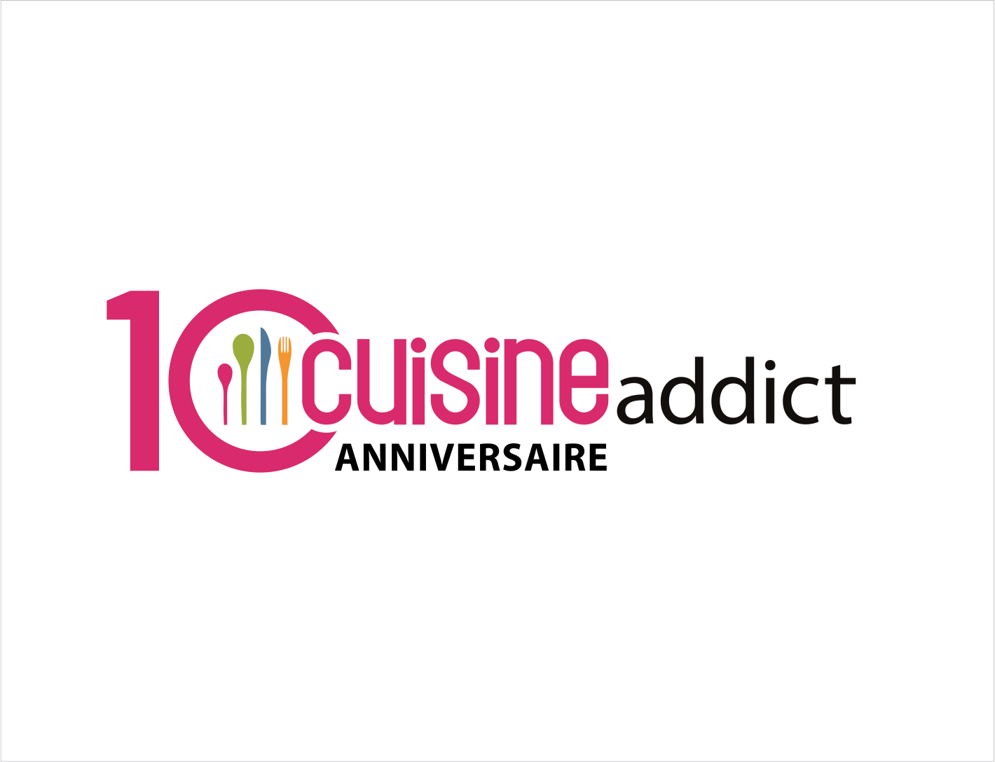
Cuisine Addict, is an e-commerce site that makes all cooks and pastries available to cookers and ingredients used by professionals and chefs! The site offers more than 13,000 product references, is present on Facebook around a community of more than 125,000 fans and has its own brand blog since 2018. The site Cuisineaddict, celebrates this year (2019) its 10 years of existence. On the occasion of this particular anniversary, we wish to equip ourselves with a new event logo to accompany the festivities which will punctuate all this year 2019. For this logo we wish something festive, colorful and modern without losing sight of the current logo , signed for 10 years. The logo should start from the current base, a horizontal logo, consisting of 2 main elements: cutlery (fork, knife, spoon, spatula magenta, green, blue, orange) and the name of the site (kitchen addict magenta color and black). These two elements (the 4 covers and the name of the site) are to be preserved imperatively in the declination of the logo. The idea is to "decline" or "customize" the current logo to make it an event around the site's 10th anniversary. The typo "Cuisine Addict" must not be changed, it must be kept. Internet users must be able to recognize us through this new event logo.
Target Market(s)
Lovers of Cuisine, Pastry
Industry/Entity Type
E-Commerce
Logo Text
Cuisineaddict
Look and feel
Each slider illustrates characteristics of the customer's brand and the style your logo design should communicate.
Elegant
Bold
Playful
Serious
Traditional
Modern
Personable
Professional
Feminine
Masculine
Colorful
Conservative
Economical
Upmarket
Requirements
Must have
- The logo should contain "10 years", refer to the birthday. The logo must include the two main elements of the current logo: the cutlery and the name of the site The Kitchen Addict typo must not be changed The Internet users must be able to recognize us through this new event logo.
Nice to have
- A festive, dynamic and modern side. The bottom can be neutral or colored.
Should not have
- Avoid too childish or too feminine.