Massage School Logo - Change the A and get rid of the castle
Want to win a job like this?
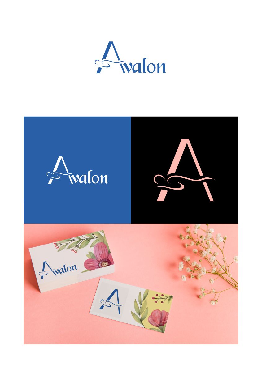
This customer received 167 logo designs from 86 designers. They chose this logo design from rinald as the winning design.
Join for free Find Design Jobs-
 US$150
-
 167 designs
-
 86 designers
Logo Design Brief
Need a logo that shows that we're a massage school by looking at it. Something preferably simple & minimalist. The full name is Avalon School of Massage, though would like Avalon by itself, and A for uniform embroidery purposes. Included is a picture of the old logo (castle) and a concept of how the new logo would just lose the castle and have a new version of the A that looks like a massage therapist working on a client. Would probably prefer not to change the logo too much from the existing (definitely need to lose the castle), but I'm open to ideas.
Target Market(s)
18-45 yr old ppl into wellness
Industry/Entity Type
Massage Therapy
Logo Text
Avalon
Logo styles of interest
Wordmark Logo
Word or name based logo (text only)
Lettermark Logo
Acronym or letter based logo (text only)
Font styles to use
Colors
Colors selected by the customer to be used in the logo design:
Look and feel
Each slider illustrates characteristics of the customer's brand and the style your logo design should communicate.
Elegant
Bold
Playful
Serious
Traditional
Modern
Personable
Professional
Feminine
Masculine
Colorful
Conservative
Economical
Upmarket
Requirements
Must have
- The 'A' must convey massage since it will be embroidered on uniforms. Logo in vector format preferable.
Nice to have
- Hands or something on one of the other letters to convey massage.
Should not have
- Should not have castle at the end of the logo.