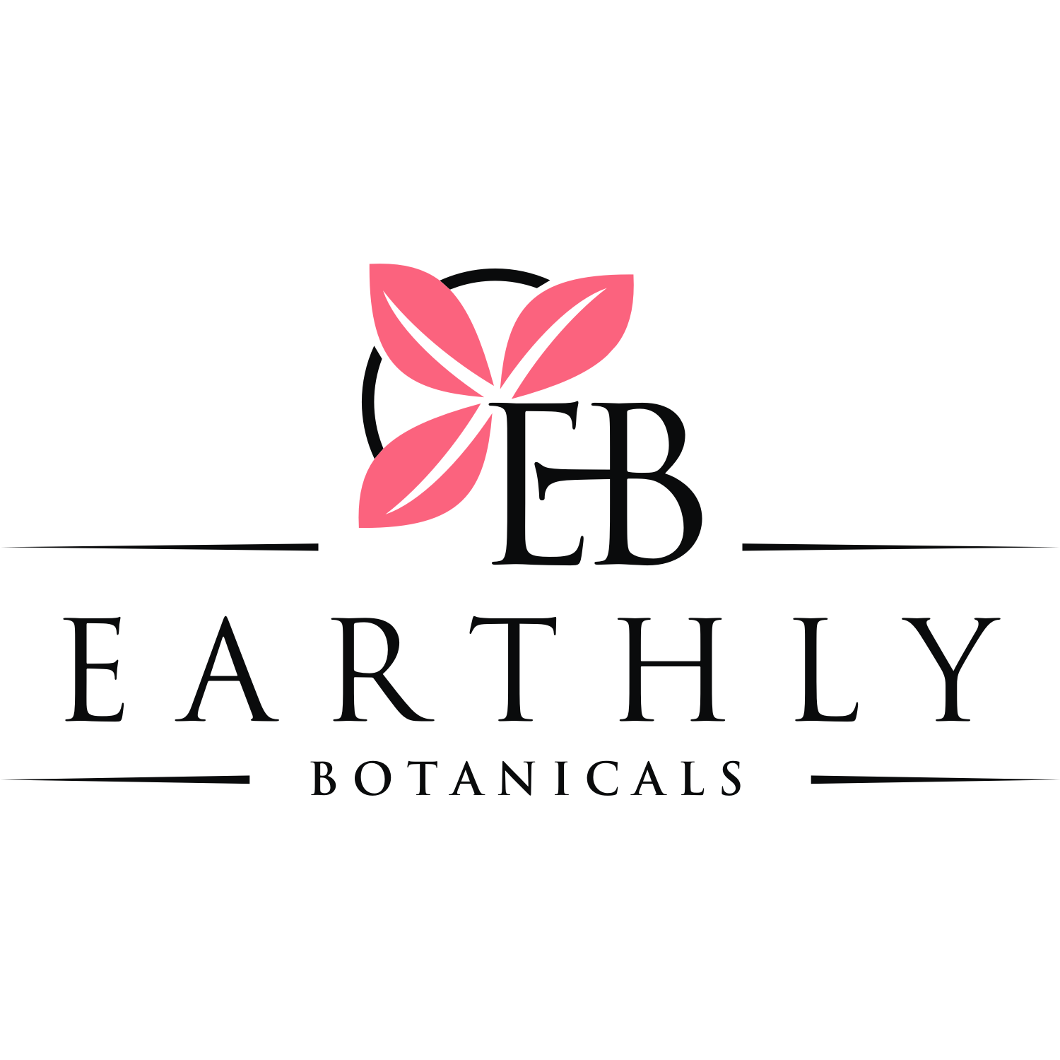
New & Fresh Logo for organic hair product

Want to win a job like this?
This customer received 163 logo designs from 54 designers. They chose this logo design from T I K H E - L M W as the winning design.
Join for free Find Design JobsLogo Design Brief
we are looking for a new fresh look. this logo will be used for our organic based professional hair product line. we are leaning towards a "farmhouse" clean, simple yet something that speaks.."we are made out of plants" vibe. i have attached a few pictures of some things we like however these are rough drawings and need to be discussed to understand what we are looking for. We like a combination of things in each of the pictures attached and would like it to come together as one.
Updates
I am So very sorry this is taking so long, we have decided on designs from 2 designers and they know who they are.
It is also with a heavy heart we have had a death in our family. we will be making our final decision in 1 week. Thank you for understanding
Danny
Added Tuesday, February 26, 2019
Target Market(s)
professional hair stylists and their consumer base
Industry/Entity Type
Hair Care Product
Logo Text
EB & Earthly Botanicals (see pictures)
Logo styles of interest
Wordmark Logo
Word or name based logo (text only)
Lettermark Logo
Acronym or letter based logo (text only)
Colors
Colors selected by the customer to be used in the logo design:
Look and feel
Each slider illustrates characteristics of the customer's brand and the style your logo design should communicate.
Elegant
Bold
Playful
Serious
Traditional
Modern
Personable
Professional
Feminine
Masculine
Colorful
Conservative
Economical
Upmarket
Requirements
Must have
- we are looking for a clean, simple and fresh "farmhouse" look and feel in one color only, black. nothing too ornate or busy.
- we are unsure about particular fonts to use as this is not an area of expertise. if the fonts from the attached pictures could be used would be something of interest.
Nice to have
- something unique, not necessarily drawn directly from the pictures as these are examples of the way we are leaning. we would like some guidance as to what the rest of the label will evolve into as to font used.
Should not have
- we do not want borders on this logo around this new art