Medical Cannabis Logo reDesign
Want to win a job like this?
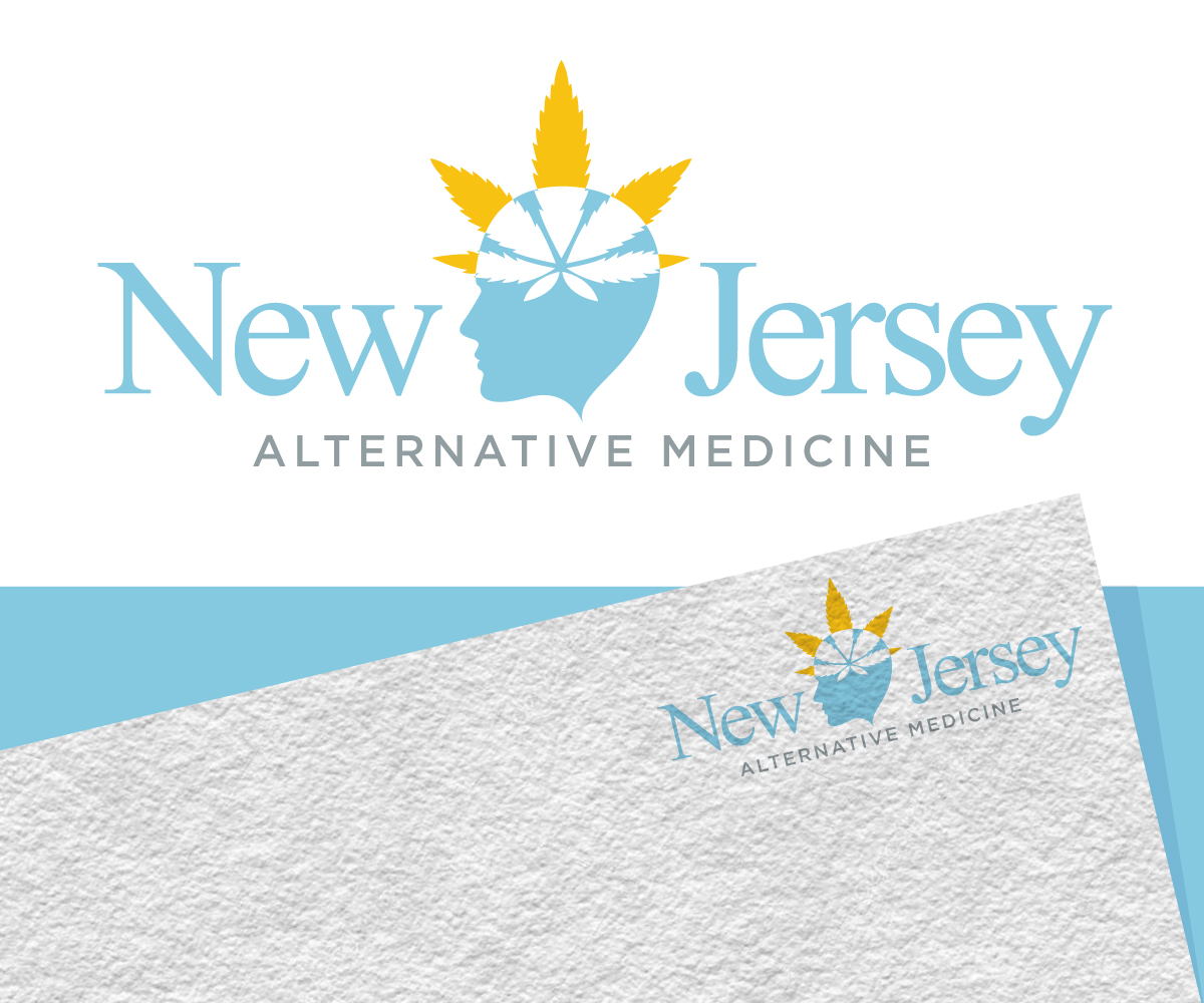
This customer received 134 logo designs from 64 designers. They chose this logo design from Jay Design as the winning design.
Join for free Find Design Jobs- Guaranteed
-
 US$150
-
 134 designs
-
 64 designers
Logo Design Brief
We are a medical cannabis company based in NJ. our original logo needs to be redesigned to represent a sleeker feel similar to modern logos like apple, microsofts redesign windows logo etc. We would like to keep the overall elements of our logo however creativity is welcome. This is a medical office that is already established. We also would like to keep the overall color scheme as it's what we're used to. We primarily use the circle logo but I wanted to show you examples of how we use it.
Industry/Entity Type
Alternative Medicine
Logo Text
New Jersey Alternative Medicine
Logo styles of interest
Abstract Logo
Conceptual / symbolic (optional text)
Font styles to use
Colors
Colors selected by the customer to be used in the logo design:
Look and feel
Each slider illustrates characteristics of the customer's brand and the style your logo design should communicate.
Elegant
Bold
Playful
Serious
Traditional
Modern
Personable
Professional
Feminine
Masculine
Colorful
Conservative
Economical
Upmarket
Requirements
Must have
- our name
Nice to have
- flat simple logo not overly complicated must keep to the original concept of a pot leaf, brain, spine of the logo
Should not have
- overly detailed brain. the pot leaf being overly pronounced.