Condo Debts Collection Business needs a Web Design
Want to win a job like this?
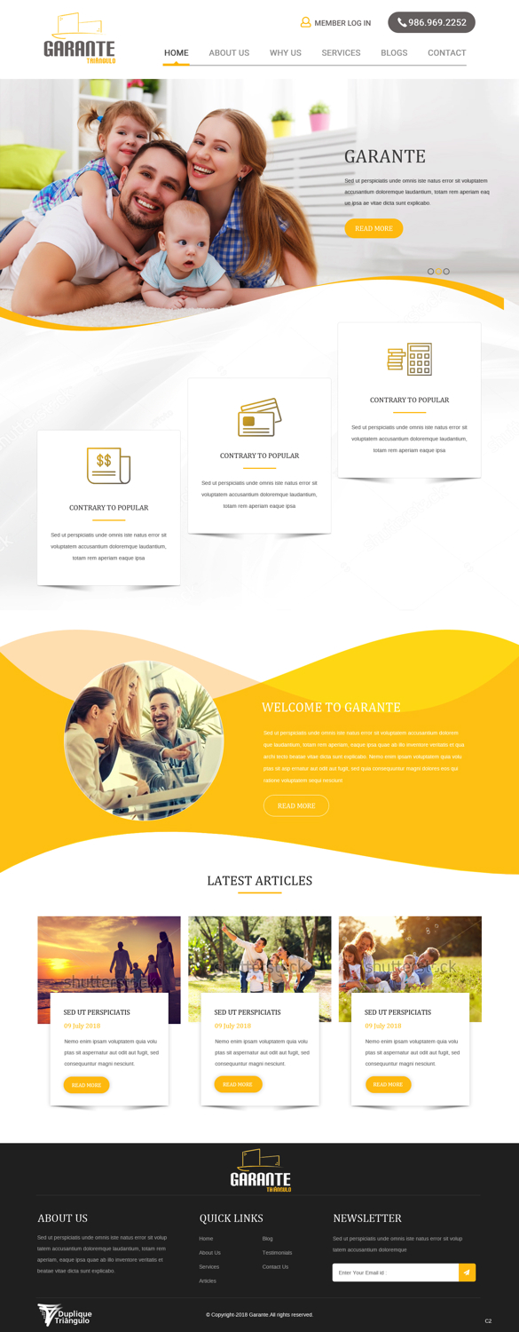
This customer received 20 web designs from 5 designers. They chose this web design from pb as the winning design.
Join for free Find Design Jobs- Guaranteed
-
 US$330
-
 20 designs
-
 5 designers
Web Design Brief
I need a site for a client, who works with condo debts collection, and ensure all revenues provided by condo fees will be always available to the building manager of condo on a specific date, regardless of defaults.
I have the logo of the companies, and some requirements on layout (kind of slider, menu options, phone number on a noble position, etc).
The same site will be used for two different companies. One of them is http://www.dupliquetriangulo.com.br/ and the other one does not have a site yet.
*** PLEASE, we have no interest in templates. We want something new***
Updates
Need extra days to review
Target Market(s)
I have two targets for this design: - Condominium's building manager. This target is looking for a solution to overdue debts on it's condo. - Residents on condominiums. This target wants to live in a better place, where their neighbors pay their condominium fees on time.
Number of Pages Required
1 page
Look and feel
Each slider illustrates characteristics of the customer's brand and the style your logo design should communicate.
Elegant
Bold
Playful
Serious
Traditional
Modern
Personable
Professional
Feminine
Masculine
Colorful
Conservative
Economical
Upmarket
Requirements
Must have
- - Slider with title, some short text related, a nice image (I prefer happy and/or peaceful family, people doing business, happy friends, and so on).
- - I have a special attention to menu. I'm looking for one I can have a nice effect, more elegant, charming, kind of innovative.
- - Phone number on the top (or clearly visible).
- - Member log in area or icon on the top (or clearly visible).
- - News/articles area.
- - Modern fonts, with good quality, sans-serif on areas where reading is more intensive (prefer Google web-fonts).
- - Colors specified on attached files.
Nice to have
- - Clear background color, cause it's better to read larger texts (like articles). Dark backgrounds makes reading difficult.
- - A site with effects (like shadows, lines, curves, gradients, lights) is usually pretty.
- - I pay attention on beautiful footers.
Should not have
- - Images with a lot of money (I don't sell richness, I sell tranquility, peace, harmony, safety).
- - Poor menu.