LavoQueen Logo/Website Design
Want to win a job like this?
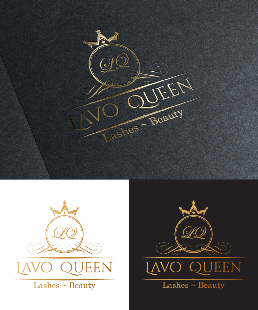
This customer received 72 logo and business card designs from 9 designers. They chose this logo and business card design from sushsharma99 as the winning design.
Join for free Find Design Jobs-
 US$210
-
 72 designs
-
 9 designers
Logo and Business Card Design Brief
I am hoping to launch more visuals for my eyelash extensions services. I am hoping to a wide range of audiences, but most females from ages 18-any age is fine. I was also hoping on utilizing some white, gold, gray accents on whatever is needed and to establish a more relaxed and calmer theme that doesn't have to be super modernized or contemporary. As you can see in the image example the colors are bold but not too colorful and has a nice style.[PLEASE REFER TO THE IMAGES SECTION OF THIS PROJECT]
Updates
Low design quality
Designs look the same
Target Market(s)
Women ages 16-80
Industry/Entity Type
Beauty
Contact Information for Business Card
Contact info: lavoqueen@gmail.com
(408)909-1111
Website: http://www.lavoqueen.com
Logo Text
LavoQueen Eyelash~Beauty (with lesser emphasis on the "eyelash~beauty" part)
Logo styles of interest
Abstract Logo
Conceptual / symbolic (optional text)
Wordmark Logo
Word or name based logo (text only)
Font styles to use
Colors
Colors selected by the customer to be used in the logo design:
Look and feel
Each slider illustrates characteristics of the customer's brand and the style your logo design should communicate.
Elegant
Bold
Playful
Serious
Traditional
Modern
Personable
Professional
Feminine
Masculine
Colorful
Conservative
Economical
Upmarket
Requirements
Must have
- Must have visual imagery of eyelashes but in more subtle ways so that it isn't overbearing and hefty. Should also have simplicity of access and lots of testimonials that doesn't seem all to "generic" (i.e. straight from Yelp)
- Must also have the line "eyelash extensions" somewhere on there but not too small where it is minimal, should be fairly noticeable by viewers.
Nice to have
- Would be nice if this project was nice and minimal and allowed ease of access in order to post in current times. Although may seem contradictory from the description, it would be nice if the theme was a little bit more on the modern side so that it reflects the minimalistic styles of this era. Which means cursive would probably not match the theme well.
Should not have
- Should not be too wordy and vast amounts of dark color schemes.