Redesign current logo to align the style
Want to win a job like this?
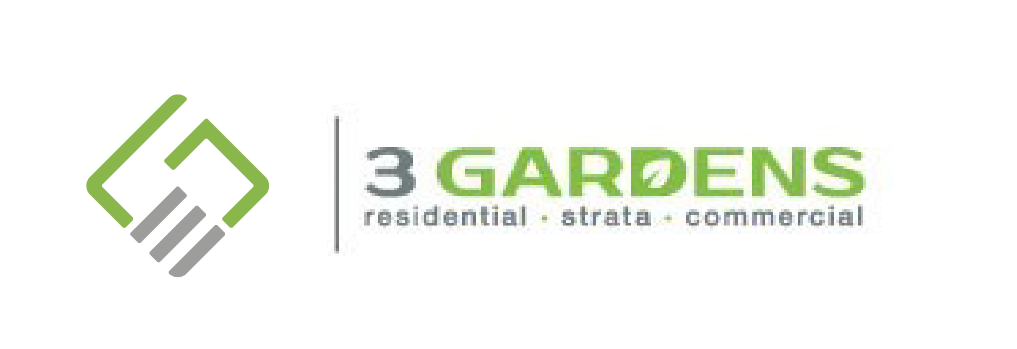
This customer received 164 logo designs from 61 designers. They chose this logo design from Gabriel Colete as the winning design.
Join for free Find Design Jobs-
 A$150
A$150
-
 164 designs
-
 61 designers
Logo Design Brief
I have a logo that I think could do with some changes.
I want to stay with the colours and the words and the overall corporate style.
I like the overall look of the logo.My main issue is how the symbol on the LHS and the words are a different style. I am seeking ideas so that the entire logo looks aligned in style.
The symbol on the LHS is meant to be a 3G, as in 3 Gardens. Whilst I like it I am thinking the 3 looks like a backward facing E and also the symbol (3 and G) are a different style to the way 3 Gardens is written in terms of font and style.
With your designs please keep the symbol on the LHS and the overall design the same, but have the same fonts in the symbol as is in the font of 3 Gardens.
Maybe a simple change of fonts on the symbol might be all that is required.
I have attached the logo file and also a sign design so you can see how it looks on a larger scale.
I welcome your ideas.
Many thanks
Alan
Updates
I have had further thoughts on the design. based on some clever designs I have seen. So in addition to the initial brief, regarding re-designing the symbol, also please consider (if possible) the idea of incorporating the letters RSC into a symbol as representative of residential, strata, commercial (which are the market segments I target). Option 1. Use 3 and G to create a symbol (as per the intial brief) Option 2: Use R S C ( or r s c) to create a symbol Option 3: Use your own creativity to create a symbol that will be representative of the business name 3 Gardens. I look forward to seeing what you come up with.
Target Market(s)
Corporate clients
Industry/Entity Type
Landscape Gardening
Logo Text
The same
Font styles to use
Look and feel
Each slider illustrates characteristics of the customer's brand and the style your logo design should communicate.
Elegant
Bold
Playful
Serious
Traditional
Modern
Personable
Professional
Feminine
Masculine
Colorful
Conservative
Economical
Upmarket
Requirements
Must have
- Same colours
Nice to have
- Style of words and symbols aligned
Should not have
- Symbol in an other position than the LHS
- Different colours than is in the original logo