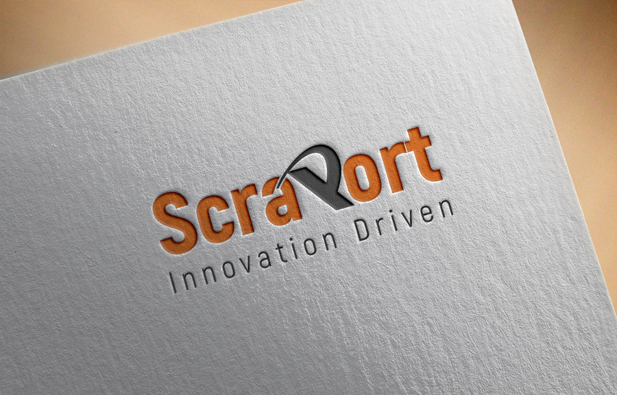
New scrap yard opening as ScraPort

Want to win a job like this?
This customer received 157 logo designs from 55 designers. They chose this logo design from sukran as the winning design.
Join for free Find Design JobsLogo Design Brief
Our business is designed to operate with the most sophisticated equipment and machinery in the world. Our business is designed to process scrap using the newest technology available in the world.
Our slogan "Driven by Innovation" or "Innovation Driven"
we chose to insert the word "Port" in our business name "Scraport" to signify they size of business we do, compared to shipping ports and airports in terms of business volume. Please consider this when making your design.
The designer can be creative with a 3D shape that represents scrap processing in a new way. (optional)
Things to consider adding into the logo
- Representing scarp processing in a new way can be shown by a shape being compressed, cut, or a combination of both
- Can be shown by a shape being cut and compressed.
- 3D circles, cones, pipes , triangles or other shapes
- combination of 2D and 3D of the layout of the text/ shapes in the logo
- The style of text needs to be a style that represents our scarp yard business
- The letter P in ScraPort needs to be larger in size than the rest of the letter in the business name.
Things NOT to be in the logo (recycling arrows, flames, cranes, machines, green leafs, oil drops)
Need to insert our slogan into the logo
Target Market(s)
large industrial facilities that generate scrap metal
Industry/Entity Type
Recycling
Logo Text
ScraPort / Driven by Innovation or Innovation Driven
Font styles to use
Other font styles liked:
- Colonna MT, Chiller, MV Boli, Nyala, Papyrus,
Colors
Colors selected by the customer to be used in the logo design:
Look and feel
Each slider illustrates characteristics of the customer's brand and the style your logo design should communicate.
Elegant
Bold
Playful
Serious
Traditional
Modern
Personable
Professional
Feminine
Masculine
Colorful
Conservative
Economical
Upmarket
Requirements
Must have
- Things to consider adding into the logo
- ScraPort could be wrapped around a shape
- - The letter P in ScraPort needs to be larger in font size and Bolder than the rest of the letter in the business name.
- - Representing scarp processing in a new way can be shown by a shape being compressed, cut, or a combination of both
- - Can be shown by a shape being cut and/ or compressed.
- - 3D circles, cones, triangles, or other interesting shapes
- - combination of 2D and 3D of the layout of the text/ shapes in the logo
- - The style of text needs to be a style that represents our scarp yard business
Nice to have
- -futuristic way of metal recycling
- - spaced out letters in the business name as such S c r a P
- o
- R
- T
Should not have
- Do NOT place (recycling arrows, flames, cranes, machines, green leafs, oil drops)